


Lick's 2025 Colour Palette of the Year

Our 2025 Colour Palette of the Year is here!
And we’re calling it New Nostalgia. Simultaneously new and nostalgic, our 2025 colour palette consists of cosy, comforting colours with a contemporary twist. These are the colours you grew up with, reimagined.
Read on to learn about 2025’s biggest trend, our colour predictions for the year ahead, the colour psychology behind the colours, and Tash’s top tips for styling them in your home.
What is the nostalgia trend and why is it so popular?
Defined as ‘a sentimental yearning for the past’, nostalgia is no new phenomenon. However, a new wave of nostalgia has emerged that we predict will persist and ramp up in 2025. More than just reminiscing over old photographs, nostalgia has become a universal sentiment and trending theme that has infiltrated mainstream culture and design, influencing everything from our fashion and food to the colours we choose for our homes.
At Lick, we know that colours have a profound ability to evoke visceral emotional responses in us, triggering memories tied to childhood experiences, family gatherings and cherished traditions. Colours that feel nostalgic can bring both comfort and emotional stability.
At its core, nostalgia is a feeling of cosiness, and in interiors, we’ve seen a move away from futuristic, white-on-white minimalist decor and towards a yearning for spaces that burst with colour, comfort and character, spaces that tell a story, reflecting lives lived and cosy memories cherished.
"The powerful connection between colour and memory is at the heart of Lick’s 2025 Colour Palette. We’ve reimagined these nostalgic colours for modern interiors, creating a palette that’s both emotionally resonant and surprisingly contemporary."
Tash Bradley, Director of Interior Design and Colour Psychologist
What are the trending colours for 2025?
Enter: our 2025 colour predictions. Next year, we predict that there will be a resurgence of cosy, retro colour palettes inspired by past decades, specifically the 1970s. Amongst the cosy colours in the palette are earthy brown, burnt orange, brownish red and plum purple. But now, these colours are making a comeback. These are the colours you grew up with, reimagined.
Shop our 2025 palette
The colour psychology behind our 2025 colours and Tash’s top tips for styling them in your home
The beauty of this palette is that all the colours can be used in one room, or throughout the house, and there are so many different ways to style the colours together to create new and exciting colour combinations.
"What makes these colours particularly nostalgic and comforting is the heavy dose of black pigment in them, toning down their saturation and making them feel cosier, deeper and more cocooning."
Tash Bradley, Director of Interior Design and Colour Psychologist
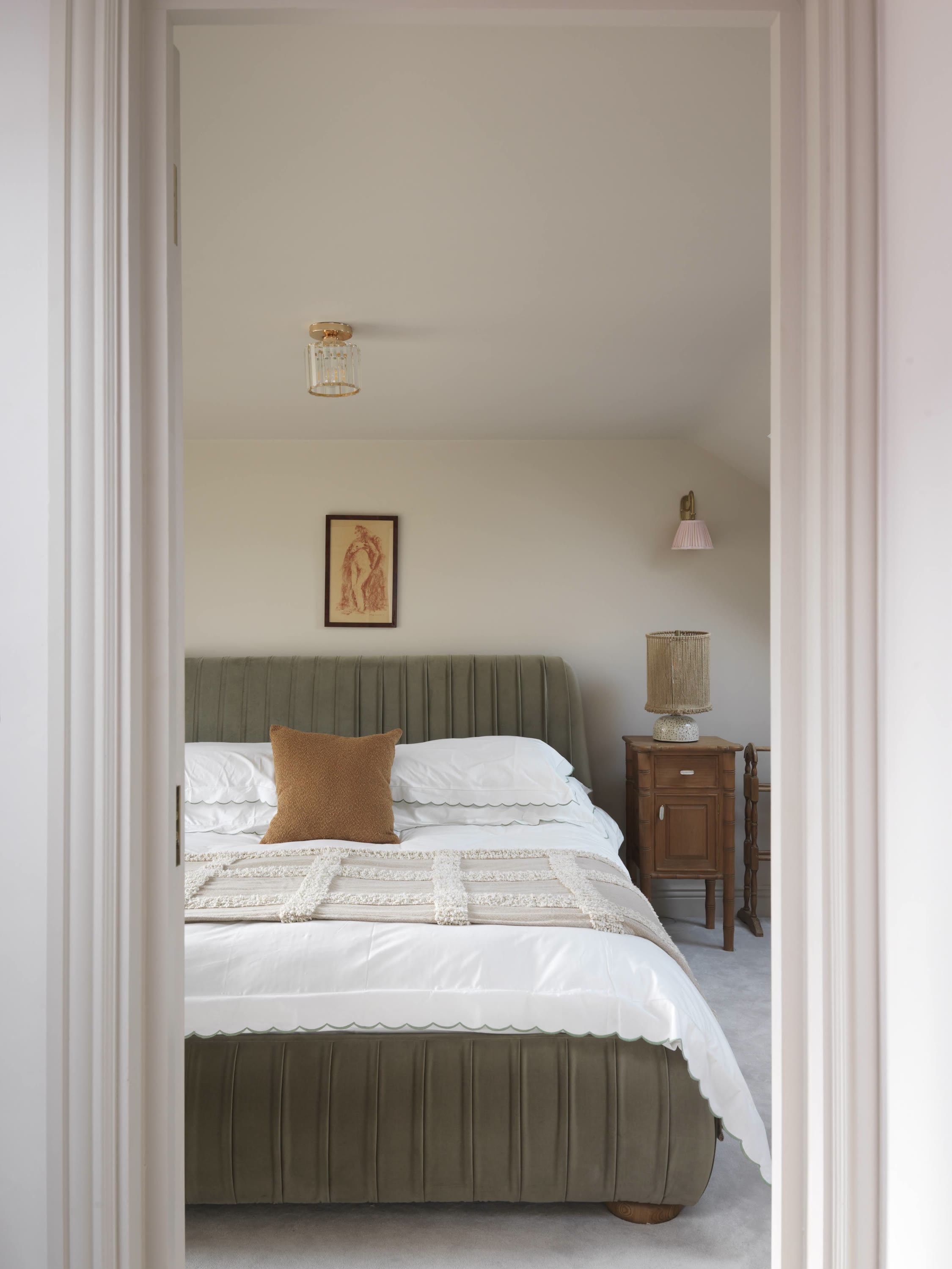
Taupe 03
A warm subtle taupe with red and grey undertones. Taupe 03 has a dependable, nurturing quality, creating rooms that feel calm and restful.
Tash’s top styling tip:
“Taupe 03 is incredibly calming, lending itself particularly well to bedrooms. With Taupe 03, lean into its natural feel and pair it with warm woods, textured blankets and accents of dusky pink, brown or orange to warm up your space.”
Pink 08
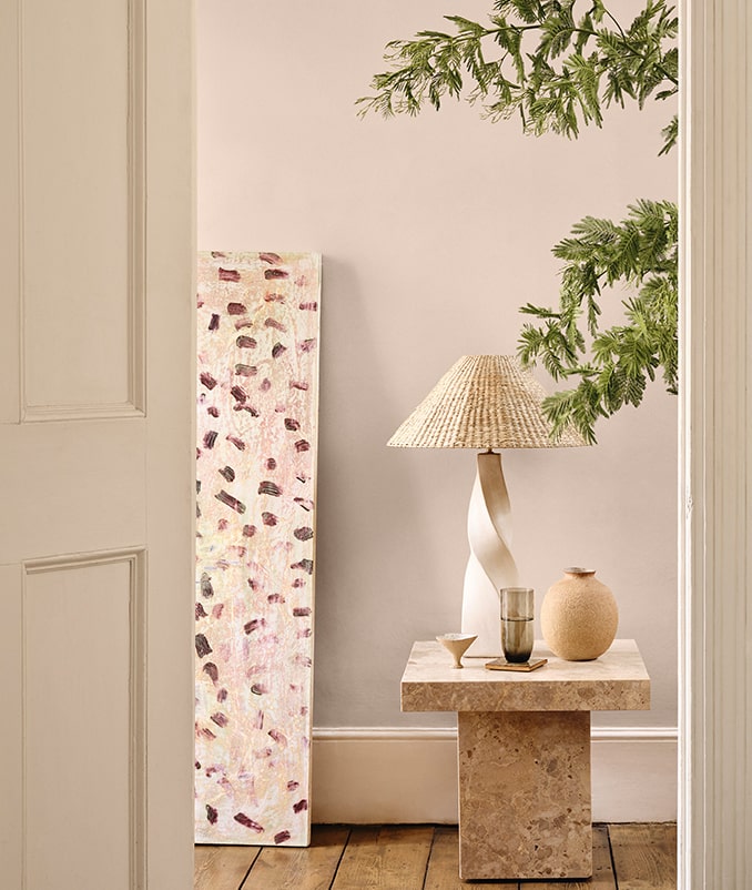
A warm mid pink with undertones of brown and yellow. Pink 08, where dusty meets dusky to create a calming cocooning comforting feeling.
Tash’s top styling tip:
“A great way to use the richer, deeper colours in our palette is by colour drenching an entire room in them. This will tone down the intensity of the colour as there is less contrast, creating spaces that feel surprisingly calm. Take Pink 08 and paint everything from your walls to your woodwork in it. Think skirting boards, radiators, doors, window frames, picture rails and ceilings.”
Brown 02
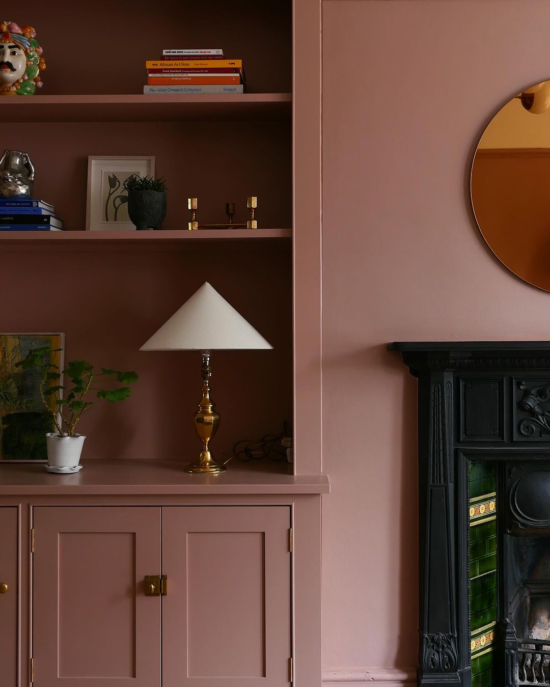
An earthy dark brown with red in its undertones, Brown 02 oozes warmth, making it perfect for creating grounded, comforting spaces.
Tash’s top styling tip:
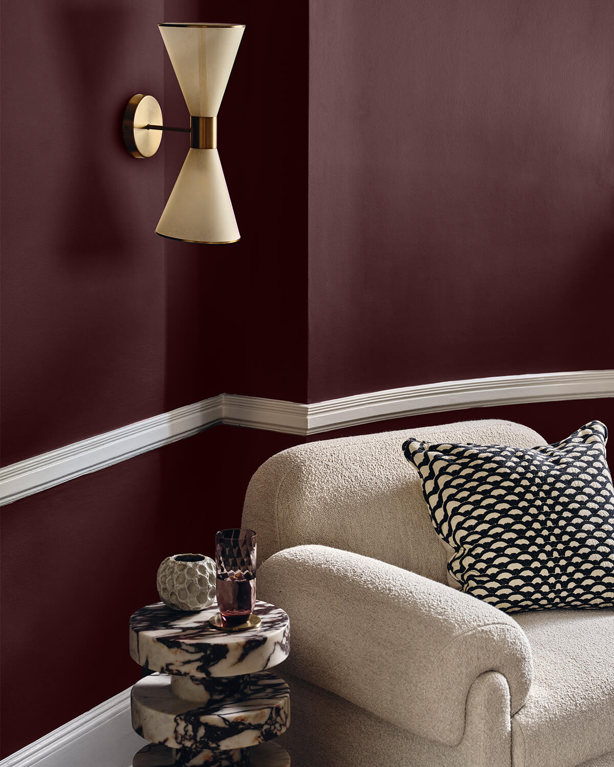
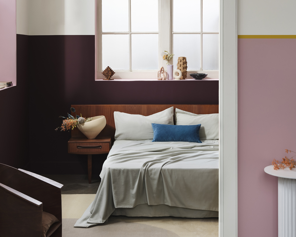
“Style Brown 02 with Purple 03 for the ultimate 2025 colour combination. These colours share a richness and depth of colour, supported by deep red undertones. This pairing works particularly well in a bedroom scheme, with Brown 02 offering grounding and assuring qualities and Purple 03 adding warmth and a touch of luxury.”
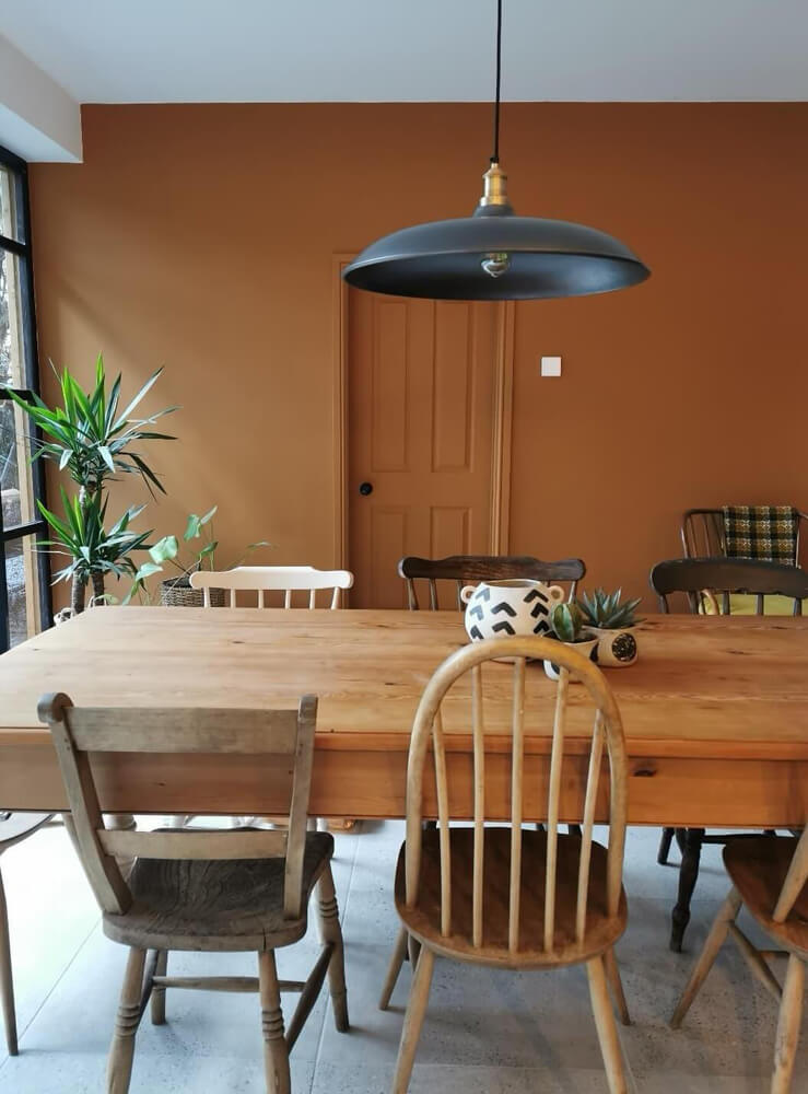
Orange 02
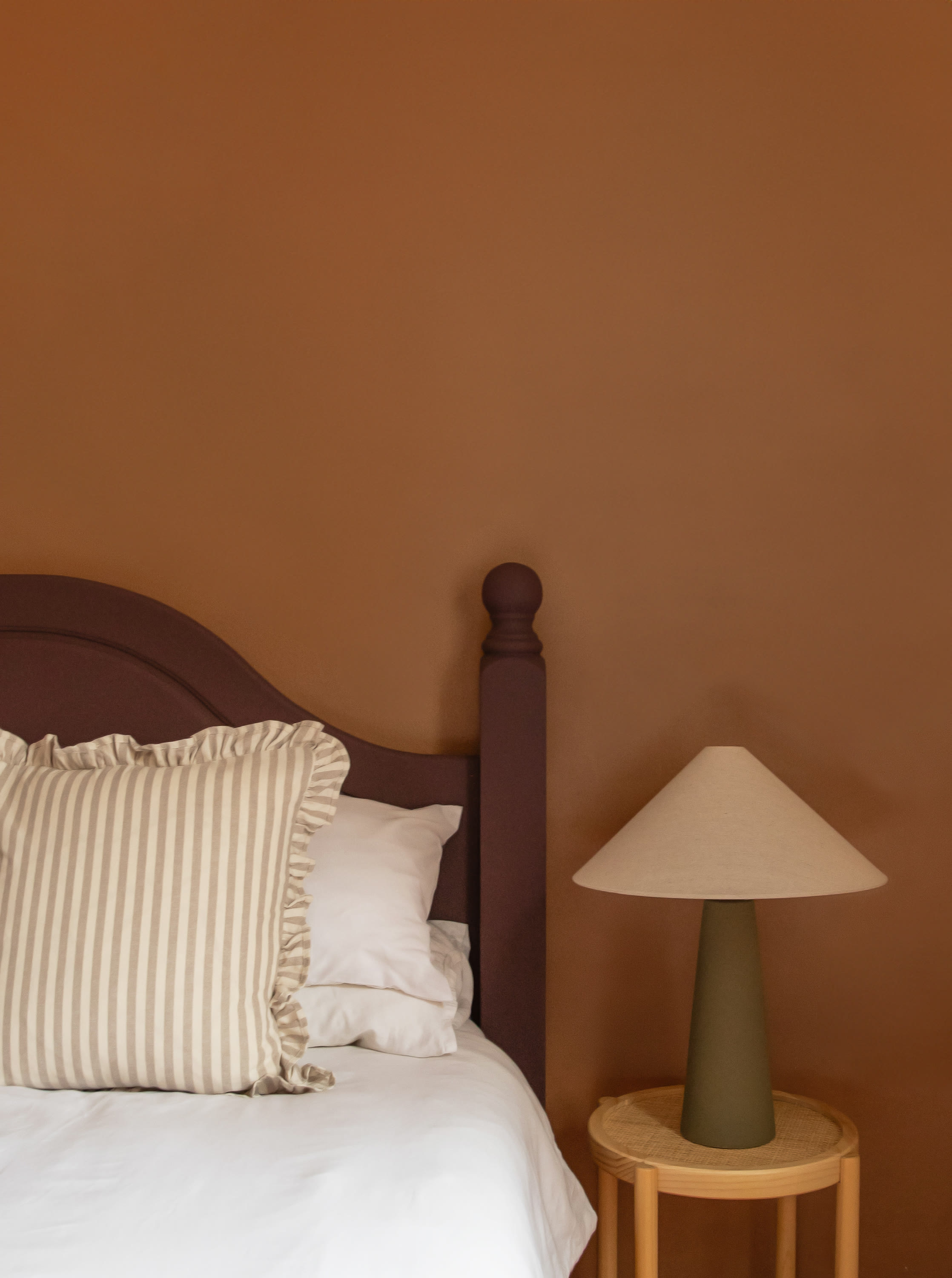
A rich earthy orange with warm brown undertones, Orange 02 has a joyful quality that is comforting, making your space feel relaxing and peaceful.
Tash’s top styling tip:
“The rich, grounding tones of Orange 02 pair perfectly with the more neutral colours in our palette, like Taupe 03. I also really recommend incorporating lots of warm woods and plants in the home, as the green and brown tones emphasise the earthy-ness of the Orange 02, creating tonal harmony and a grounding feel.”
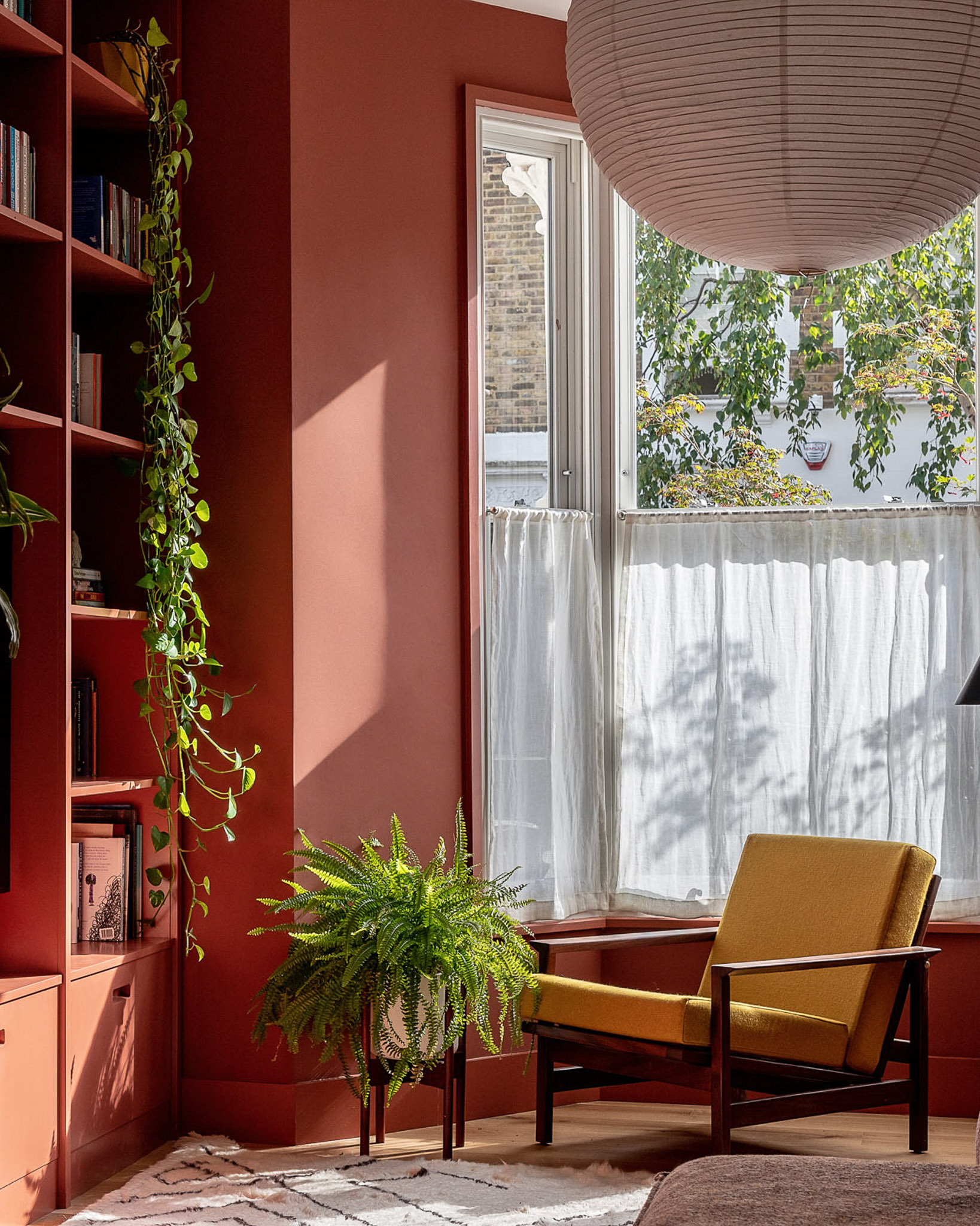
Red 01
A balanced mid-red with grey undertones. Red 01 is full of passion with a warm energy that makes you feel daring and bold.
Tash’s top styling tip:
“Whether you're colour drenching a room or looking for a pop of accent decor, this energising red will entice all of your senses, whilst creating a timeless look and feel. Deep, warming and cocooning - Red 01 looks stunning paired with warm woods or orange accents for a cosy analogous colour scheme.”
Blue 04
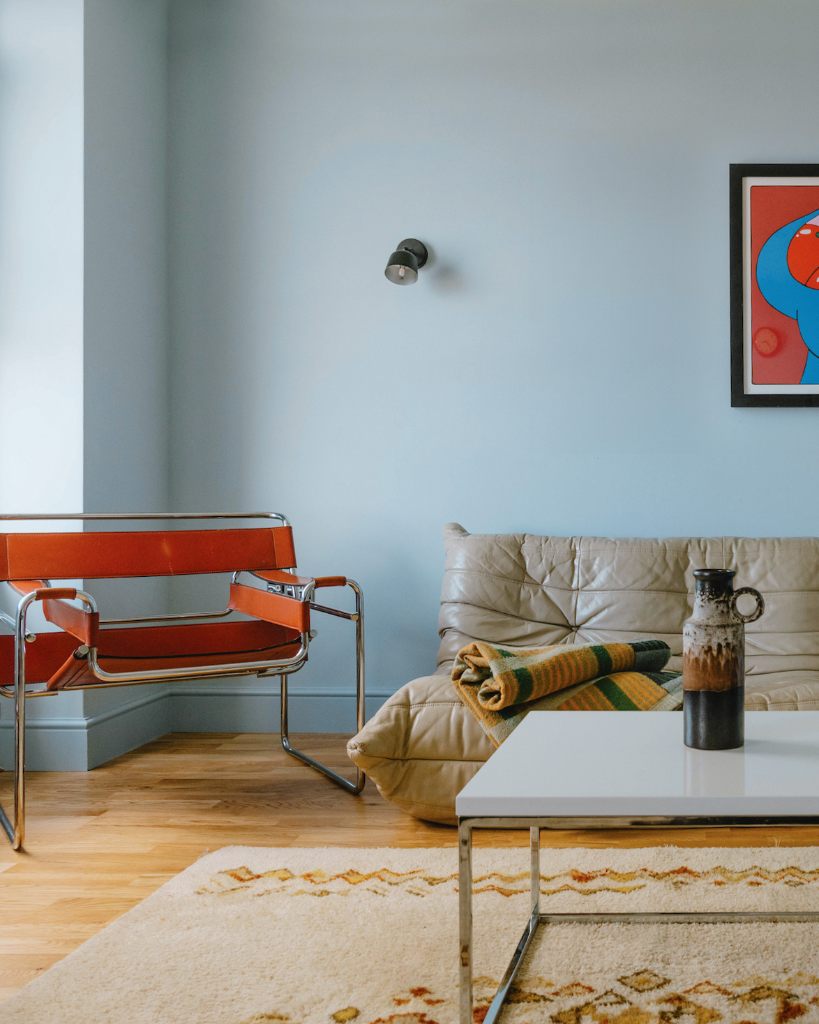
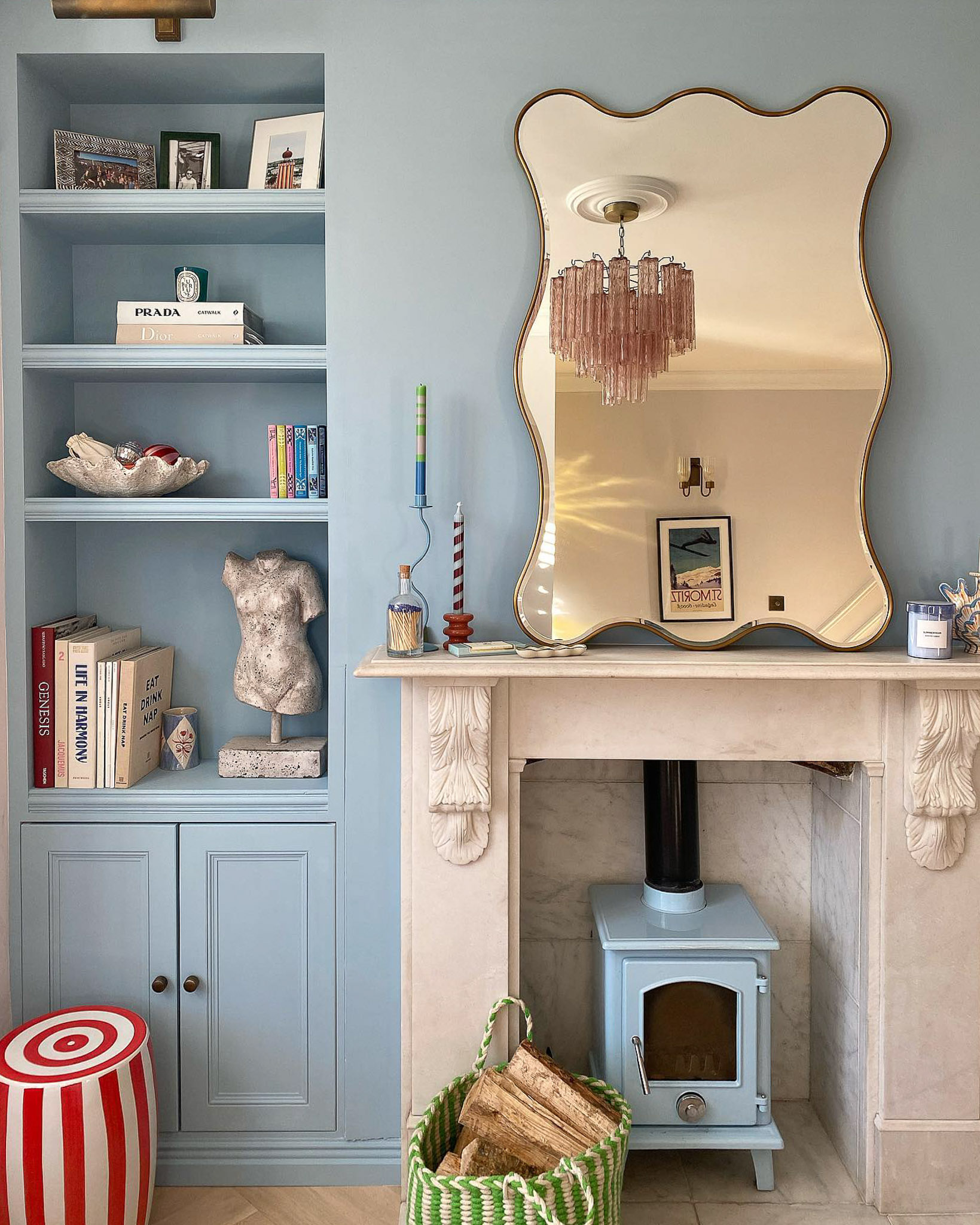
A cool mid-blue with grey undertones, Blue 04 has a soft and gentle quality which makes it feel approachable. Perfect for calm spaces which evoke reflection and rest.
Tash’s top styling tip:
"The power of this blue is it’s ability to elevate and expand a room. Go bold with a splash of Blue 04 on your ceiling, or colour drench an entire room for an enveloping and calming feel. Colour drenching with this blue will not only give your space a contemporary and sophisticated look, but it will also make the walls recede outwards, making the room feel bigger.
For an uplifting colour scheme, pair Blue 04 with its complementary colour, such as our rich and warming Orange 02. For a more natural and textured look, pair Blue 04 with warm woods and grounding neutrals like Taupe 03. The soft, earthy notes of this taupe complement Blue 04’s grey undertones, and when combined, the result is a colour scheme that feels balanced and soothing to be around."
Purple 03
A dark velvety purple with blue and yellow undertones. Purple 03 oozes cosiness and sophistication, creating warm spaces that offer a feeling of luxury and power.
Tash’s top styling tip:
“Embrace the darker colours in our palette to create a glamorous space. Purple 03 is so packed full of pigment and depth that it demands your attention. It looks incredible in downstairs bathrooms where you can afford to play around and go bold, and also in dining rooms where you want to create sophisticated, cocooning spaces. Pair Purple 03 with marble for added luxury and accents of fresh blue for a contemporary feel.“
Black 02
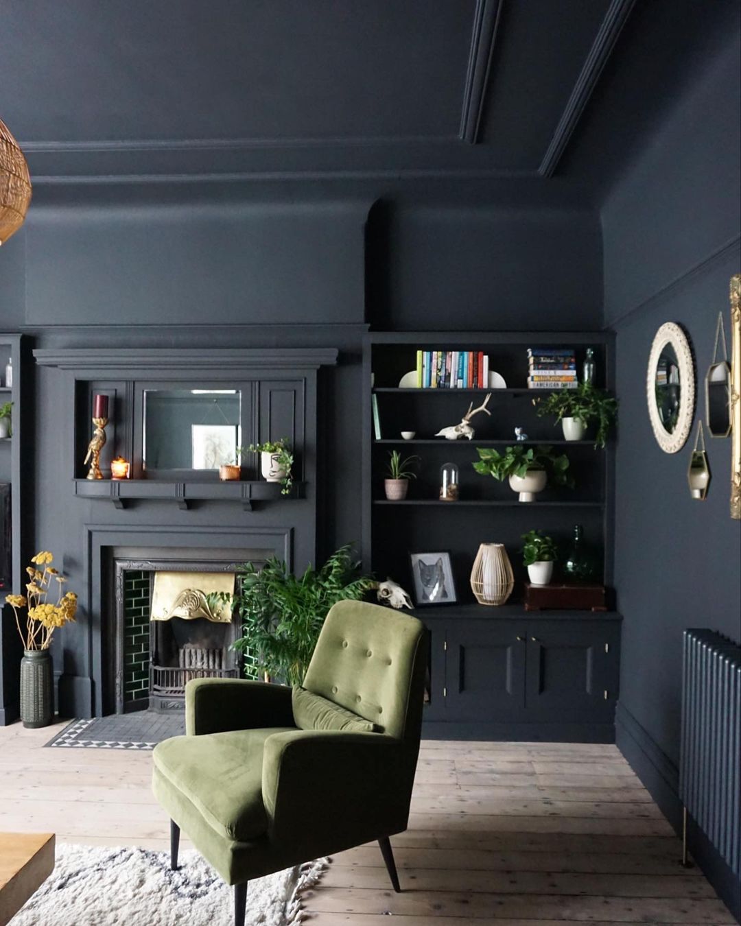
A dark velvety black with warm red undertones. Black 02 exudes elegance, creating spaces that feel empowering and decadent.
Tash’s top styling tip:
“Every room needs to have an element of black in it. Black helps to ground a room and brings a bit of character, I recommend adding black even for rooms with neutral colour schemes. A great way to incorporate black is by painting shelving, or upcycling a piece of furniture such as a chair or the legs of your kitchen table - this is a lovely way to bring a bit of depth to the room.
Decorating your room in Black 02 can look so elegant. My biggest advice is to commit to the colour and wrap the whole room in the same shade, including woodwork. The black will wrap, soften and fall into the background of the room. I recommend painting the ceiling white to keep natural light and provide a contrast. If committing to this, keep your furnishings light and neutral or add a soft accent colour such as green or mustard yellow which will pop against black. These accents prevent the room from looking dark, heavy and dull and make the black look very elegant.“
Nostalgia is all about fostering emotional connections through design, and our cosy 2025 colour palette will do just that. Shop the palette here.