


Step inside a colourful seaside house, designed by Elizabeth Stanhope

Take a trip to Aldeburgh, a seaside town in Suffolk, England, where interior designer Elizabeth Stanhope has designed a joyfully colourful home for her client and her ever-expanding family. There was one key consideration when designing the home; it had to be fit for multi-generation use. Now grandparents, the client and her husband wanted the home to be multi-functional and welcoming, the perfect environment for hosting their adult children, grandchildren, as well as friends. To do this, Elizabeth used colour as a tool for creating a home that felt inviting, calm where needed, and cosy. Decorated top-to-toe in Lick, Elizabeth took inspiration from Aldeburgh's colourful beachfront houses for the home's colour palette.
“When you look around Aldeburgh, it’s basically like looking at the Lick paint collection. It is awash with glorious, joyful colour.”\n
Elizabeth Stanhope
Shop the colour palette
Watch the full house tour
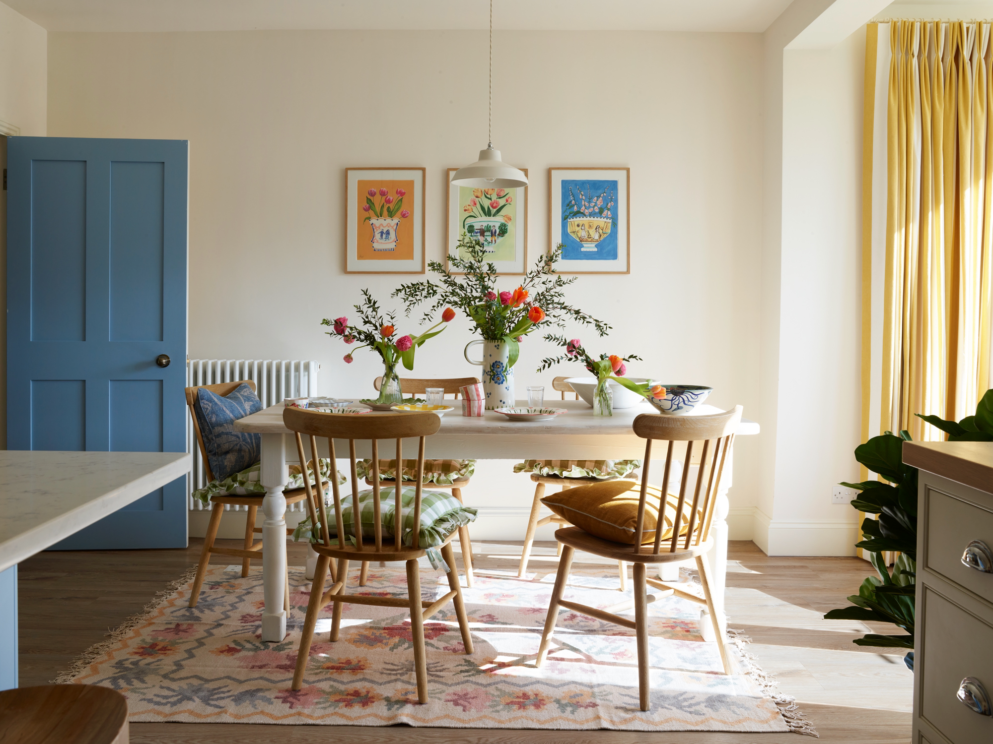
The first room you enter into is the open plan kitchen and dining room, painted in White 03 and Blue 04 (the two most used colours in the home). A busy space used for entertaining, the client wanted the overall feeling to be calm and inviting. Elizabeth looked to our whites and chose White 03, a creamy white with warm yellow undertones. As the front of the house is also east-facing, it can get quite a grey, cool light in the winter months, so White 03 was the perfect neutral to balance out the cooler light.
"Whilst we opted for White 03 on the walls to keep the overall mood calm, we also introduced lots of pops of colour to create an inviting and joyful atmosphere."
Elizabeth Stanhope
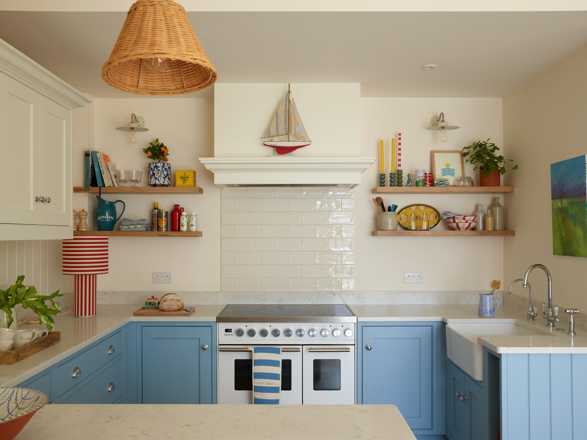
The White 03 walls continue into the kitchen, but are paired with Blue 04 lower cabinets, for a warm and cosy feel. Rattan lights, open wooden-shelving and nautical stripes also add texture and visual interest to the space.
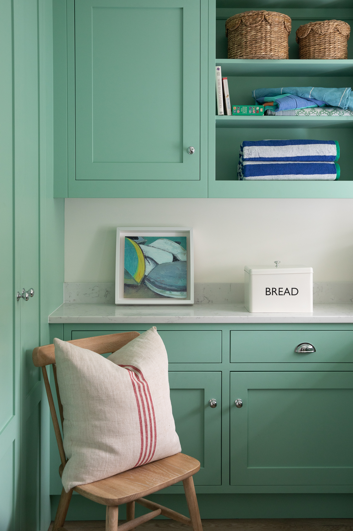
It was important for the utility room to feel fresh and clean, but still colourful. Elizabeth chose Green 08, our refreshing mint green with warm yellow and blue undertones.
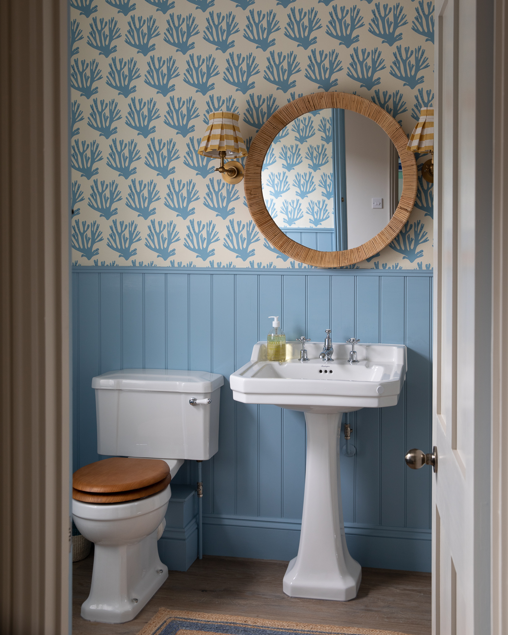
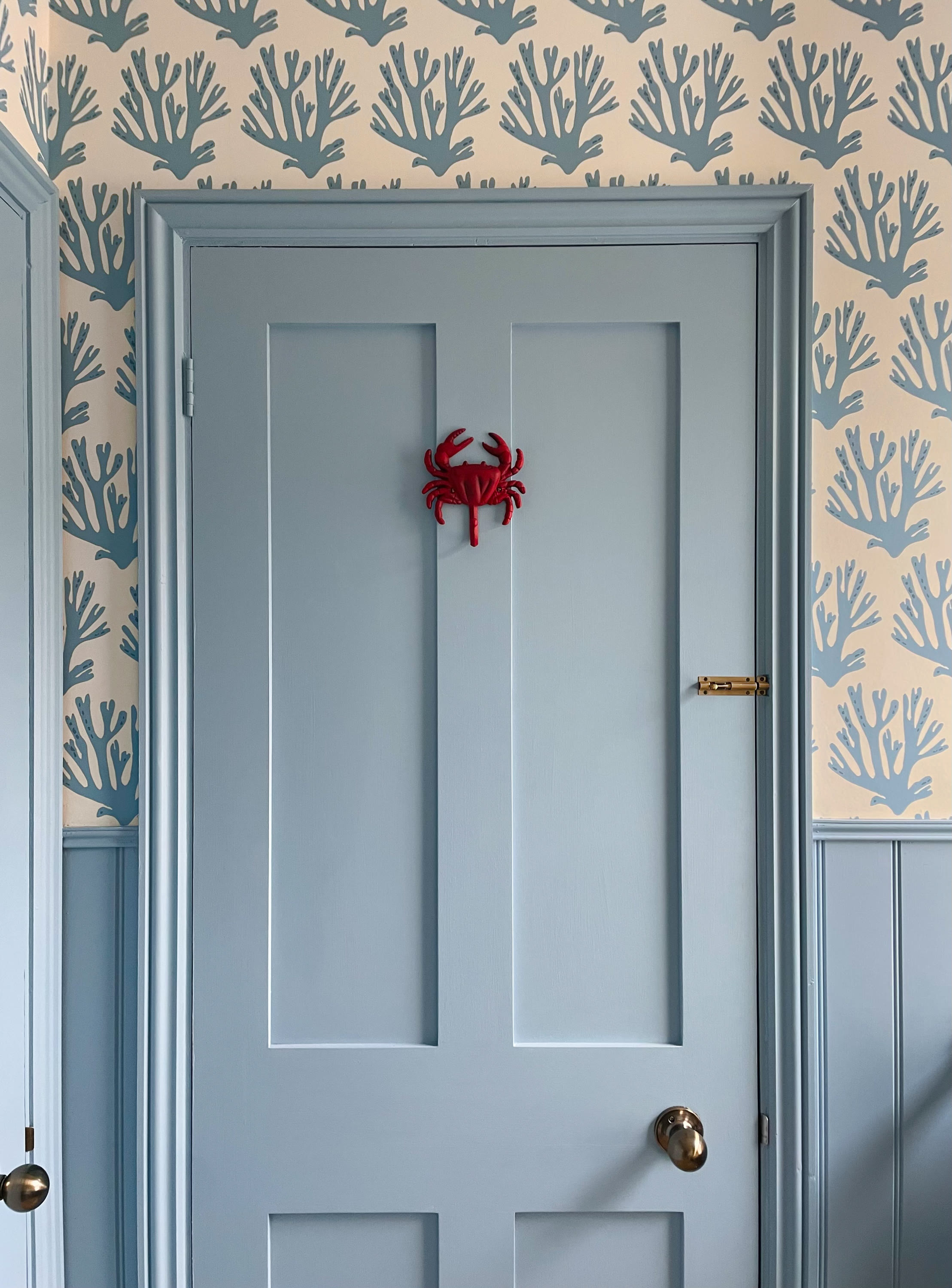
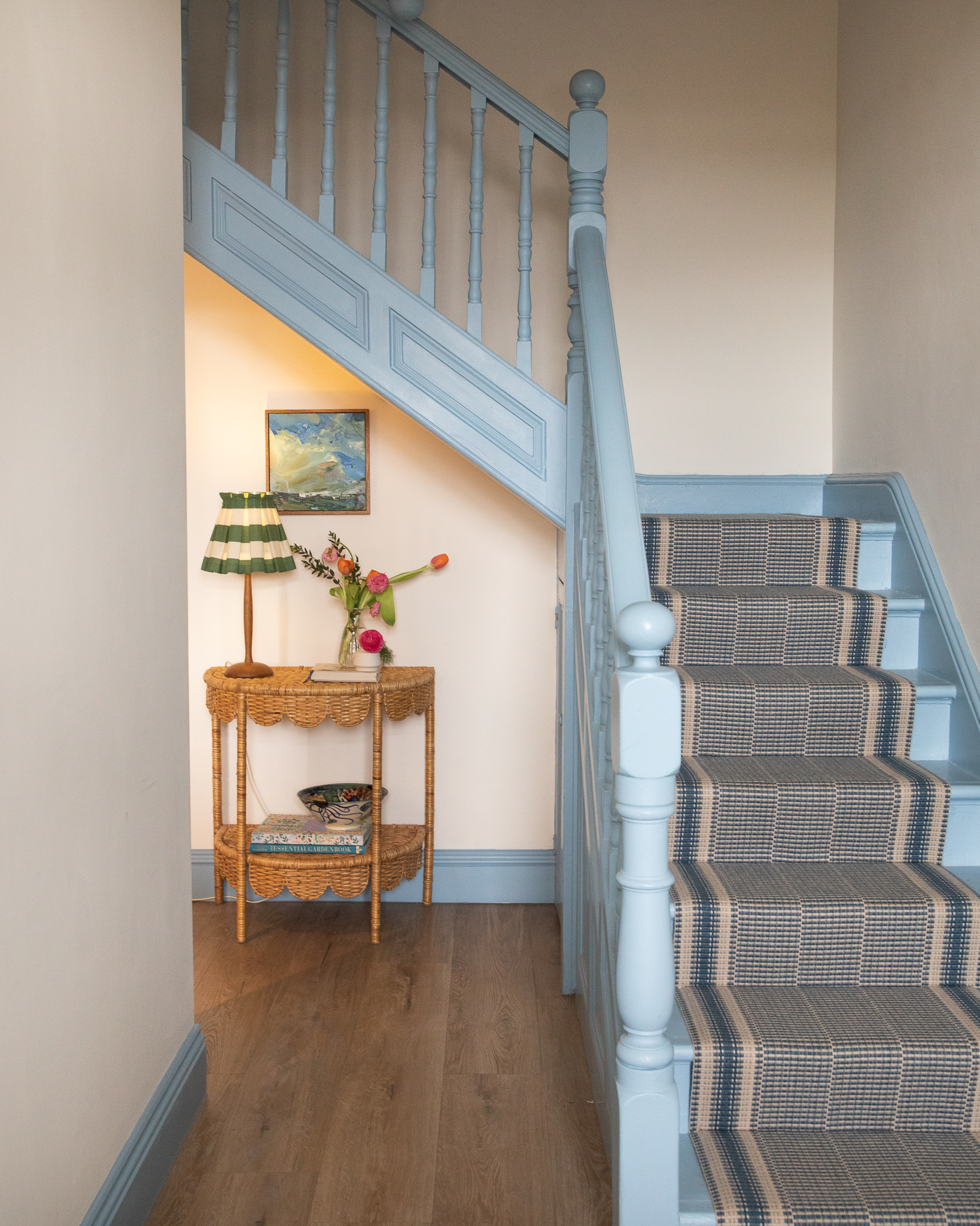
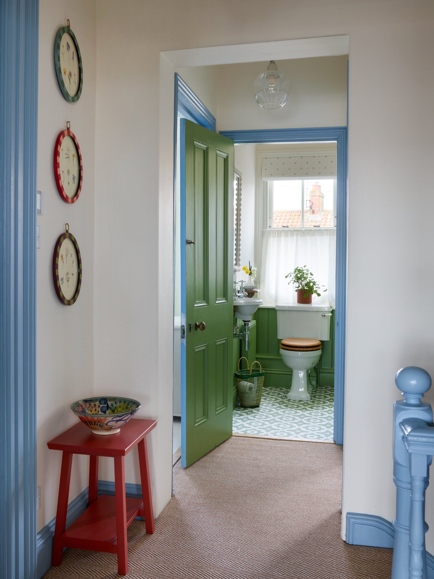
We are led upstairs and onto the landing by Blue 04 bannisters and woodwork, creating a lovely visual flow. We are then greeted by a Green 07 bathroom, a joyful surprise.
We are led upstairs by Blue 04 painted bannisters and woodwork, creating a lovely visual flow.
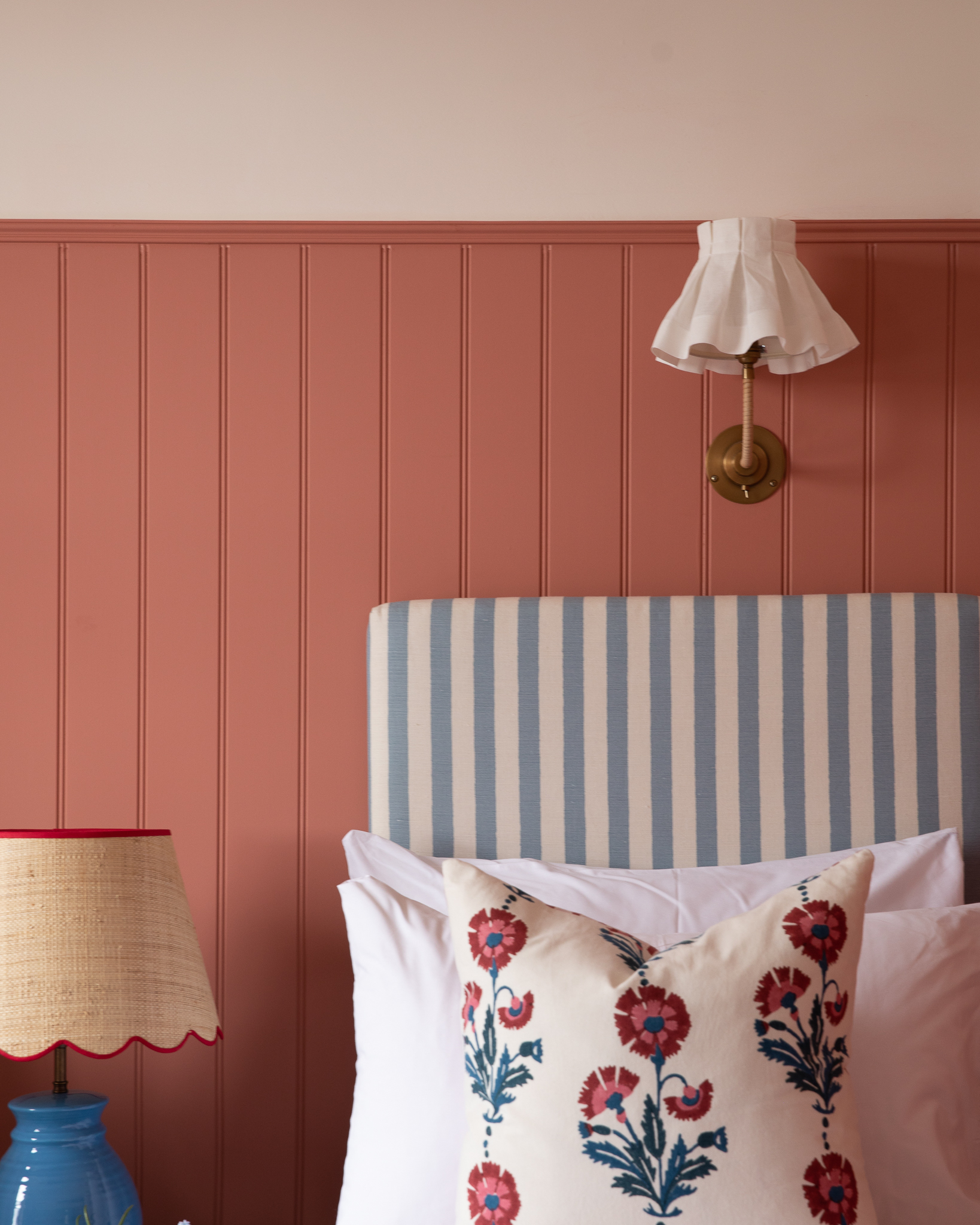
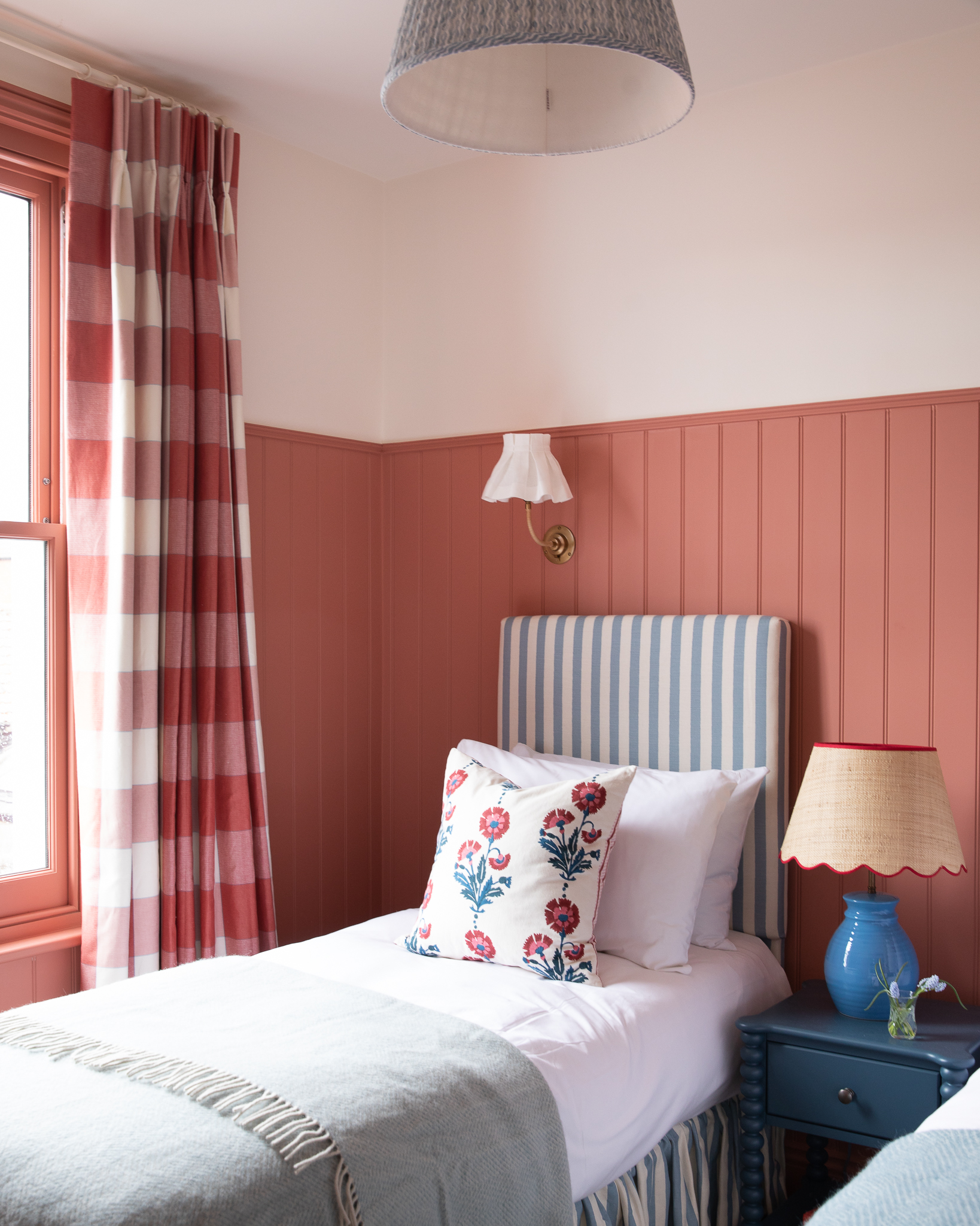
In this guest bedroom, Elizabeth opted for Red 03, our grounding terracotta with warming pink and brown undertones. Accents of red throughout the room help balance the Red 03 tongue-and-grove panelling, with subtle detailing on the scallop lamp, gingham curtains and scatter cushions. There is also a nod to nautical with the red, blue and creamy white colour scheme, without it being too gimmicky.
"Red is not an obvious choice for a bedroom, but there is something about Red 03 that is so calming and cocooning. Our client fell in love with it."
Elizabeth Stanhope
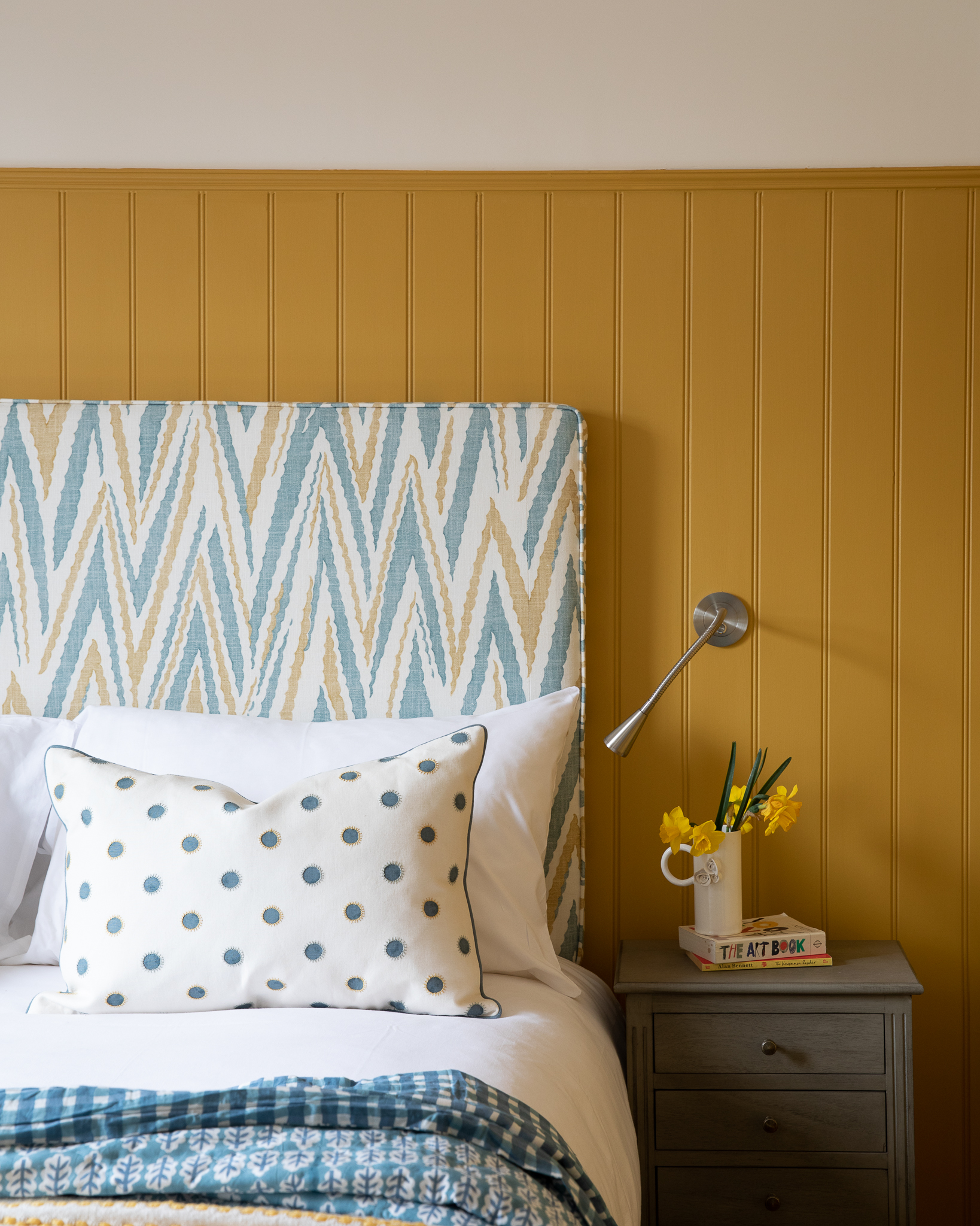
Similarly to the Red 03 bedroom, Elizabeth chose to do a half-painted wall of tongue-and-grove panelling, this time in Yellow 02. The yellow is paired with White 03 painted walls and ceiling, fresh blues in the bedding and Pookie lamp base, and a Blue 04 painted door.
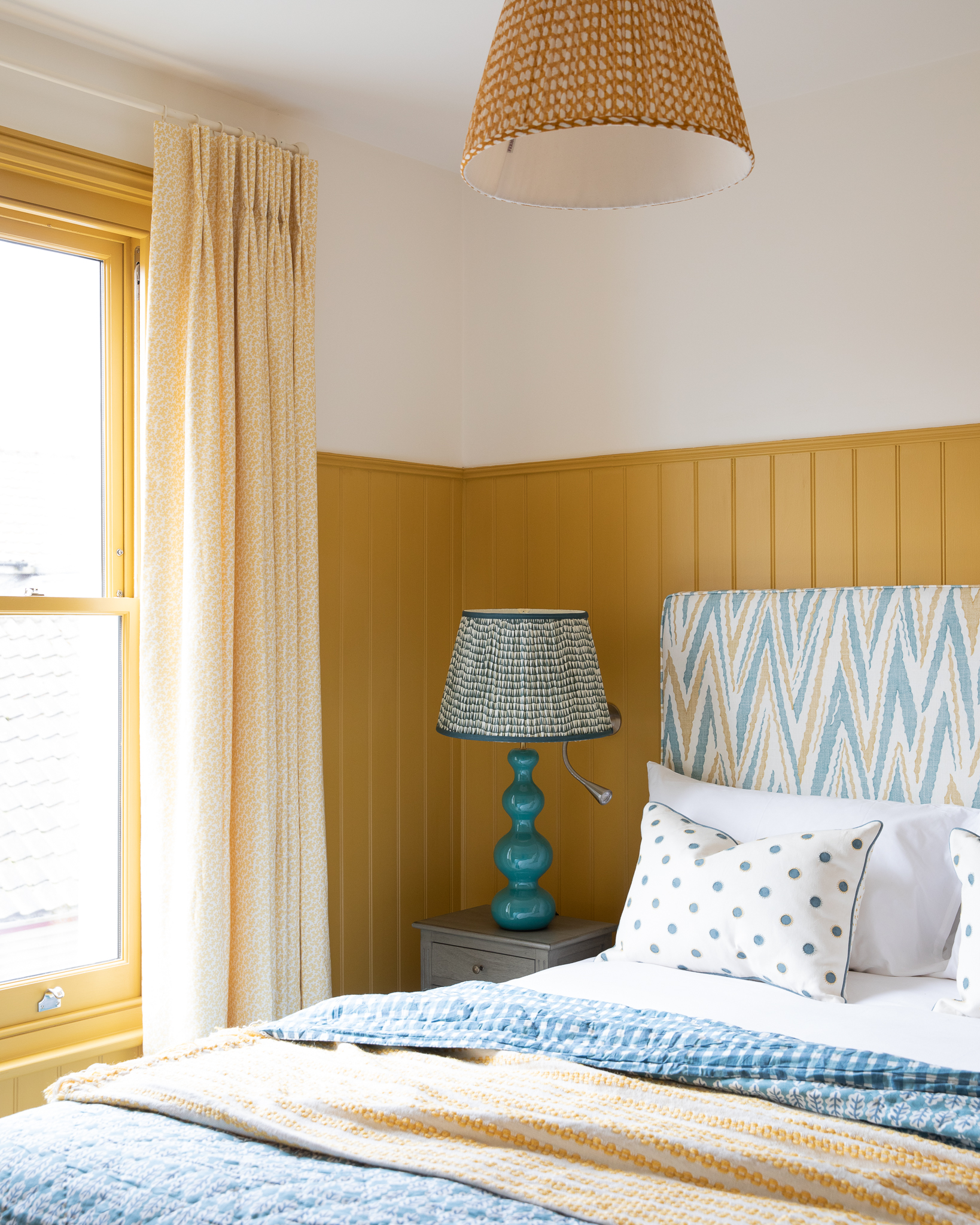
"We wanted each guest bedroom to feel comfortable, cosy and joyful. Colour was integral in creating this feeling."\n
Elizabeth Stanhope
Love the colours used in this house? Shop the palette below: