


Farmhouse meets eclectic in Tash Bradley’s stunning Somerset home

Turning a four-bed rented cottage in Somerset into a cosy farmhouse-meets-eclectic home is no mean feat. But Tash Bradley, Lick’s Director of Interior Design, managed it––without breaking the bank. A lesson in combining decor styles, as well as how to decorate a rented home whilst still making it feel like your own, we take a look at how Tash transformed this centuries-old house, with a lick of paint.
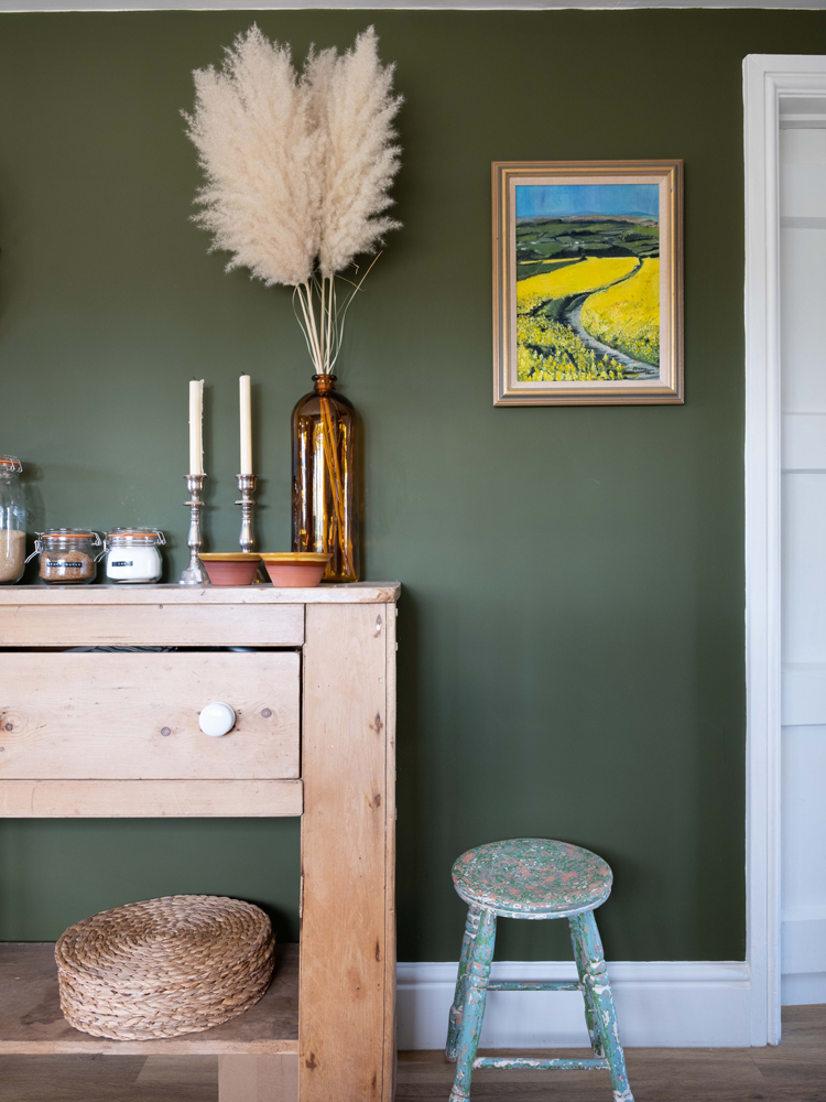
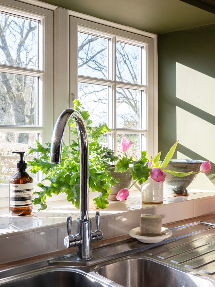
Tash’s kitchen decorated in Green 05 Rome House
"The units are a pale, creamy colour, so we wanted to go darker on the walls to have a cool contrast." That's where Green 05 Rome House comes in. "It has a strong yellow undertone giving it a rich energising feel–ideal for a kitchen". According to Tash, this room doesn't get much light;
"According to Tash, this room doesn’t get much light. “I always encourage people to work with the light that they’re given. People often think that you should go light if you have a small, dark room. However, when you try to fight against the light by going for lighter paint choices, those colours can look dull, flat and lifeless. Darker colours, on the other hand, actually absorb shadow, meaning the corners of rooms are more blurred. This makes a smaller, dark room appear larger than it is. Going darker, therefore, gives the illusion of space and can also make a room feel warmer”.
Tash adds a pine dresser to store their plates and tableware, as well as some eco-friendly, plastic-free Kilner jar storage, giving the kitchen a real traditional farmhouse feel.
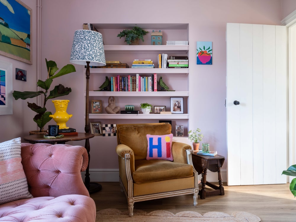
Tash’s living room decorated in Pink 04
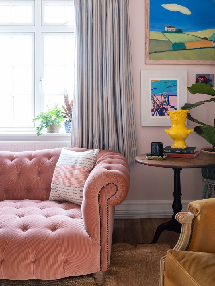
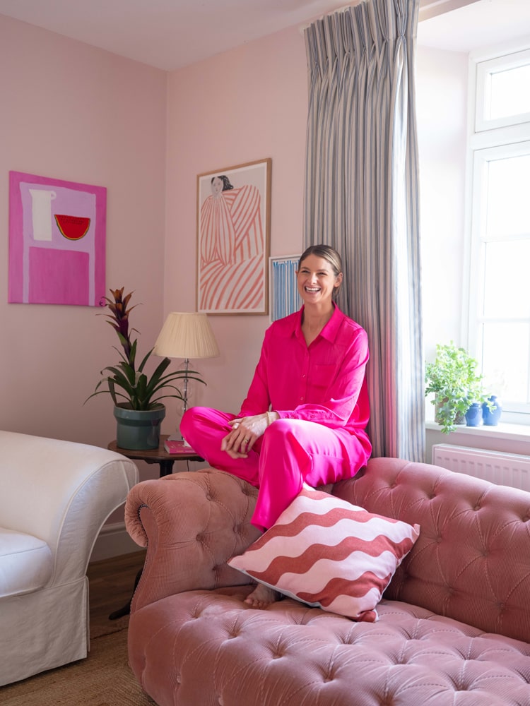
“When we’d finished painting this room, without the furniture it looked overwhelming. It wasn’t until we put the sofas back in and added the artwork and mirrors that it started to break up the Pink 04”. A lesson - if ever there was one - is to trust the process. Now, the tonal harmony instantly makes you relax––“Pink 04 is just cuddles in a tin”. Alongside playing with tones of pink (“one of the biggest interior design trends to look out for in 2022”, she says) Tash has used a complementary colour scheme in the form of a yellow vase, blue artwork, and a mustard armchair. It is quintessentially eclectic decor style and her curated collection of ornaments and trinkets make this room sing.
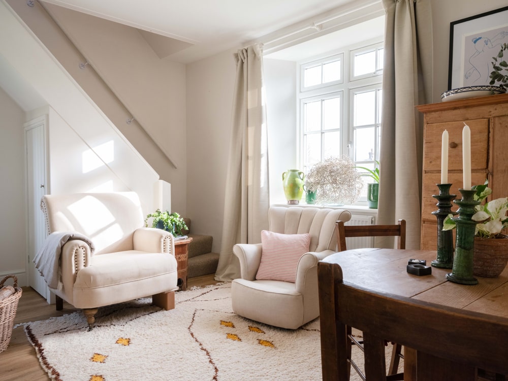
Tash's day room decorated in White 06
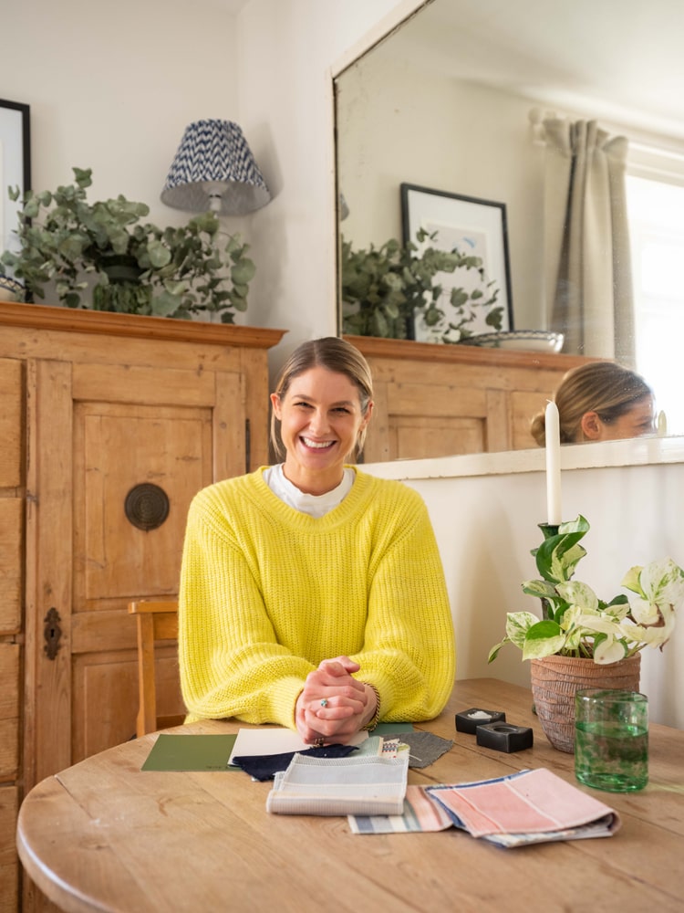
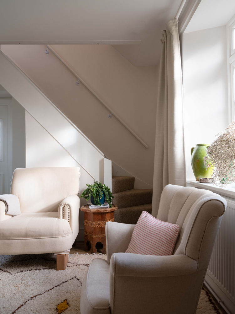
“We spend most of our time in this south-facing room and the light is just perfection, so we wanted to embrace this and keep things light and airy”. White 06 was the answer. Warm and inviting, this colour provides a gorgeous neutral backdrop that allows a Berber rug, rustic pine furnishings, and a pop of green from the garden to do the talking. It’s the perfect spot to sit with the Sunday papers, morning coffee, or a good book.
Tash’s main bedroom decorated in Pink 01
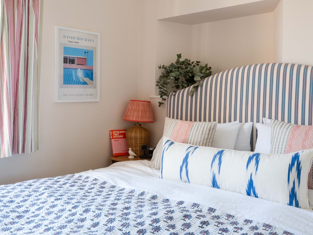
According to Tash, "if you're looking for a calming colour, Pink 01 is the answer. It physically soothes you and makes you feel relaxed". Another south-facing room, the main bedroom is filled with light. "I wanted this room to be warm and bright, so instead of going for pink and green, I went for a dreamy combination of pink and blue". This room is all about escapism: the David Hockney ‘A Bigger Splash’ print, the rattan lamp, and block-print bedspread. "It's a small room for the main bedroom, so the vertical lines on the headboard and curtain make it appear bigger as your eye travels up with the patterns," explains Tash. A nifty trick if you're trying to make the most of limited space.
Tash’s guest bedroom decorated in Green 02
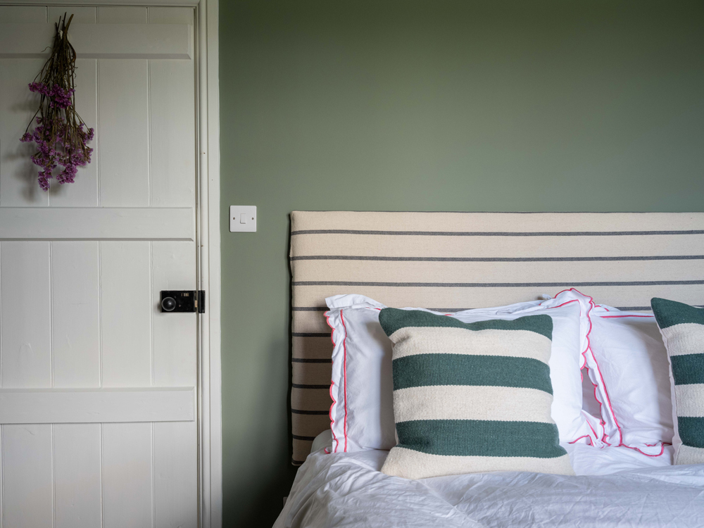
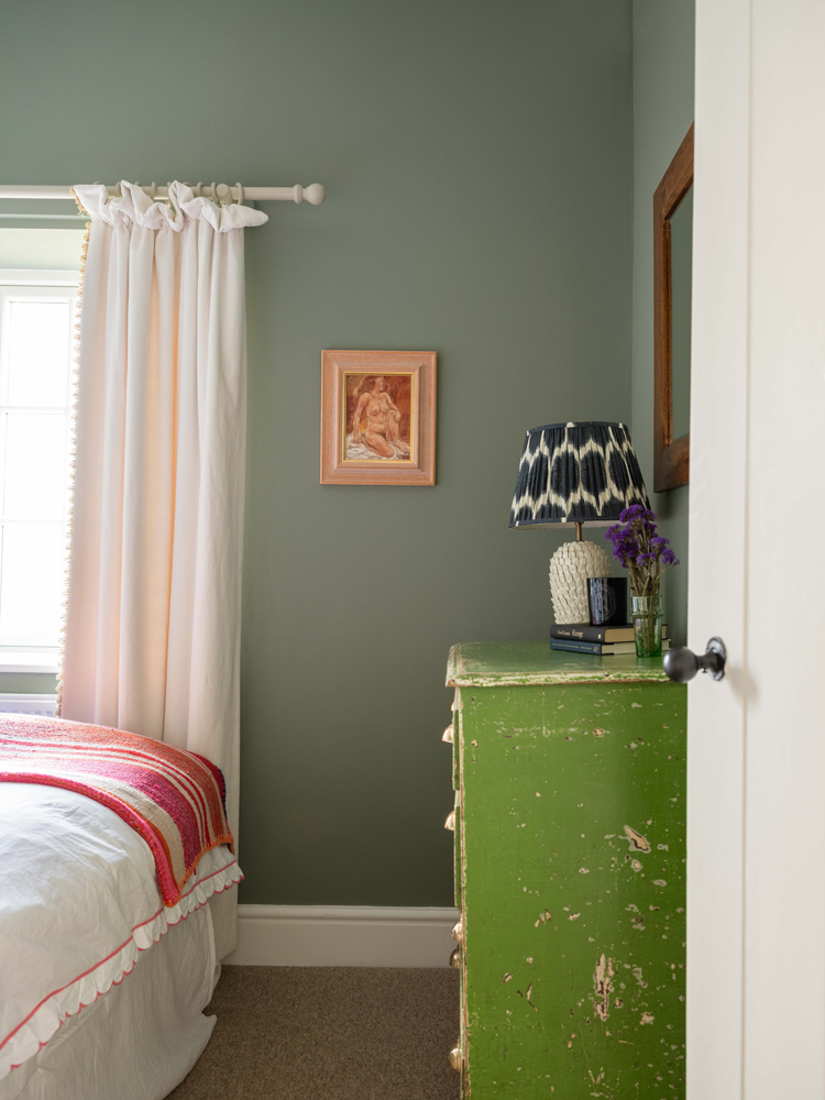
Your classic farmhouse style bedroom. "This room is quite a dark room, so I went for Green 02, which is a mid-tone to give the room a strong identity," Tash explains. "People always ask me why Green 02 is so popular. It's the perfect green to connect with you the outdoors. It's dusky, a bit muddy, strong without being overwhelming, brave yet calming." No wonder it's our customer's favourite. "It can work in any room, any direction. It's such versatile colour". Tash compliments the Green 02 walls with orange and pink accents, with a DIY upholstered headboard, colourful woven throw, and pink trim pillows.
Tash's guest bedroom decorated in Teal 01
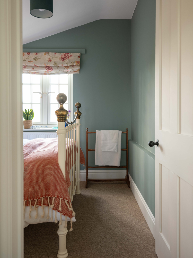
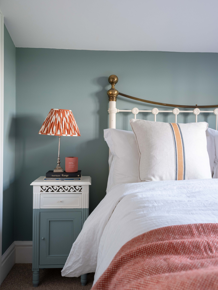
Similarly, as with the other guest bedroom, this one doesn't get a lot of natural light. Just as with the kitchen, Tash has embraced the (slightly) darker side with Teal 01. "Ideally, I'd have liked to take the Teal 01 all the way onto the sloping ceiling to make it feel really enveloping, but as we're renting, we had to keep the ceilings and skirting boards white". Alongside a classic wrought-iron bed, Tash has upcycled a pair of charity-shop bedside tables by using some leftover Teal 01 paint to make them feel more contemporary and almost blend into the walls.
It's a lesson in how - if you get your landlord on board - you truly can transform and personalise a rented home. Though there may still be limitations, renting doesn't mean you have to live in a white-on-white box. Nor does living in a period cottage mean that you can't embrace the eclectic decor style. Get some more inspiration and take the tour of interior designer, Pandora Taylor’s eclectic decor home.