


How to create a colour scheme around your favourite artwork

According to Tash Bradley, our Director of Interior Design, how to create an interior design colour scheme around a specific piece of artwork is one of the most common questions asked during colour consultations. From family heirlooms and treasured investments to flea-market finds, artwork can be incredibly personal, and for this reason, it is rarely parted with. Many decorators look for ways to design their homes around their artwork, using it to inform their colour choices.
How to choose a piece of art for your home
When it comes to buying art, don’t follow trends; “buy it because you love it. Buy it because it makes you feel happy. Buy it because it transports you to a certain time or memory!” says Tash. “Both my husband and I are obsessed with art, so something we’ve started doing recently is purchasing a piece of art to celebrate a special moment and putting it somewhere we will see it all the time. That way, whenever we see it, we’re reminded of that moment,”. Having recently bought a piece that they’ve hung opposite their bed— it’s the first thing they see in the morning.
Things to consider when creating a colour scheme around artwork:
1. What mood and feeling are you trying to create?
Artwork can dramatically change the way a room feels, so think about whether you want to recreate the feeling of the artwork in your room. A seascape painting filled with gentle blues and sandy beiges will bring a sense of calm to a space, and will blend seamlessly into a coastal-style living room. Whilst a neon-coloured abstract painting will be stimulating and demand the attention of a room.
2. What style/era is the piece?
Is your artwork traditional or contemporary? Would your artwork work in an eclectic living room or a neutral bohemian one? Consider whether you want your interiors and your artwork to have the same style.
3. Consider size and presence
The size of the artwork and how you position it within the room will have an impact on how dominant it is, and how drawn our eyes are to it.
4 .Do you want the artwork to be the focal point?
It’s important to decide whether you want your artwork to be a focal point in your room or not. However, “you’ve got to make sure that the whole room is considered,” Tash explains. “It’s all about tying everything together. Just because you want a piece to stand out doesn’t mean you have to go white on white throughout—you want your home to celebrate your art, without it feeling like an art gallery”.
5. Will the artwork match or contrast with your decor?
If you want your artwork to complement your decor, you can create colour harmony by building a colour scheme from the colours featured in the artwork. However, your artwork can still work with your decor even if it doesn’t perfectly match the colour palette. You can also do this by asking yourself; what are the qualities of the room that you love, what are the qualities of the art that you love and how can they complement each other?
The most important thing to consider when creating an interior colour scheme around artwork is colour harmony. Colour harmony pulls out a story with each element in the room. It is what makes a sofa, vase, rug and art piece all complement each other. When creating a colour scheme around your artwork, you can achieve colour harmony by picking out the colours that you’re most drawn to from a piece and channeling those throughout the room. Read below to see how:
5 art-inspired interior design colour schemes
One of our favourite places to source affordable artwork is Enter Gallery. That’s why we chose a few key pieces from their collection and challenged Tash to create an interior colour palette surrounding them.
Remember, treat these Lick colour palettes like mood boards - they’ve been created to inspire an overarching colour scheme for walls, furniture, accessories, and more.
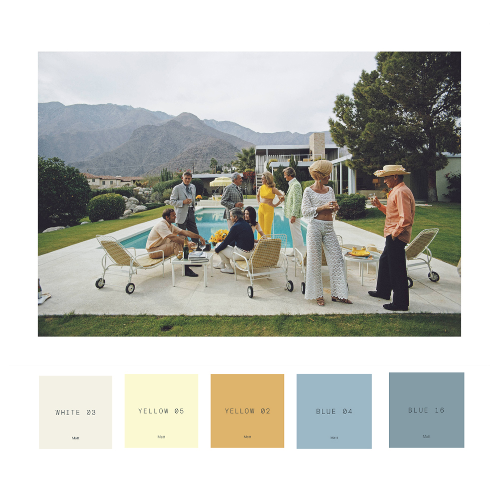
If you’re choosing a piece of art for the mood it creates, then this print by American photographer Slim Aarons is a whole vibe. Capturing a 1970’s poolside party at a Palm Springs house, it oozes elegance and style. “I love this palette,” says Tash, “and what I love about this print is that it invites you to channel a little splash of yellow”. “You can be really confident using any of these colours on your walls. If you want to go bold, go for Blue 16 on your walls with Yellow 05 or Yellow 02 accents,” Tash recommends. “Or, if you’re after something more pared-back, try White 03 on your walls and Blue 04 on your ceiling or woodwork”. Again, why not mirror those yellow accents in your furnishings or accessories.
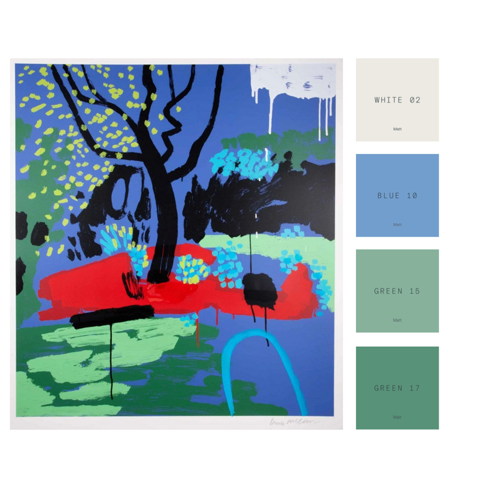
Turquoise Hose Pipe Ban is a bright and bold piece inspired by conceptual artist Bruce McLean’s garden in Spain. Regarded as one of the major players in contemporary British art, “this piece commands attention” remarks Tash. “We’re seeing a lot of blue-green, blue-red colour schemes at the moment, so without intending to, Bruce is very on-trend”. Despite those bold brushstrokes and rich reds, there’s a nod to nature and the accompanying palette is very calming. For a bolder option, she recommends “Green 15 on the walls and woodwork to make that blue really pop”. Alternatively, for something a little more gentle, “go for White 02 on the walls with either Blue 10 or Green 15 on your woodwork”.
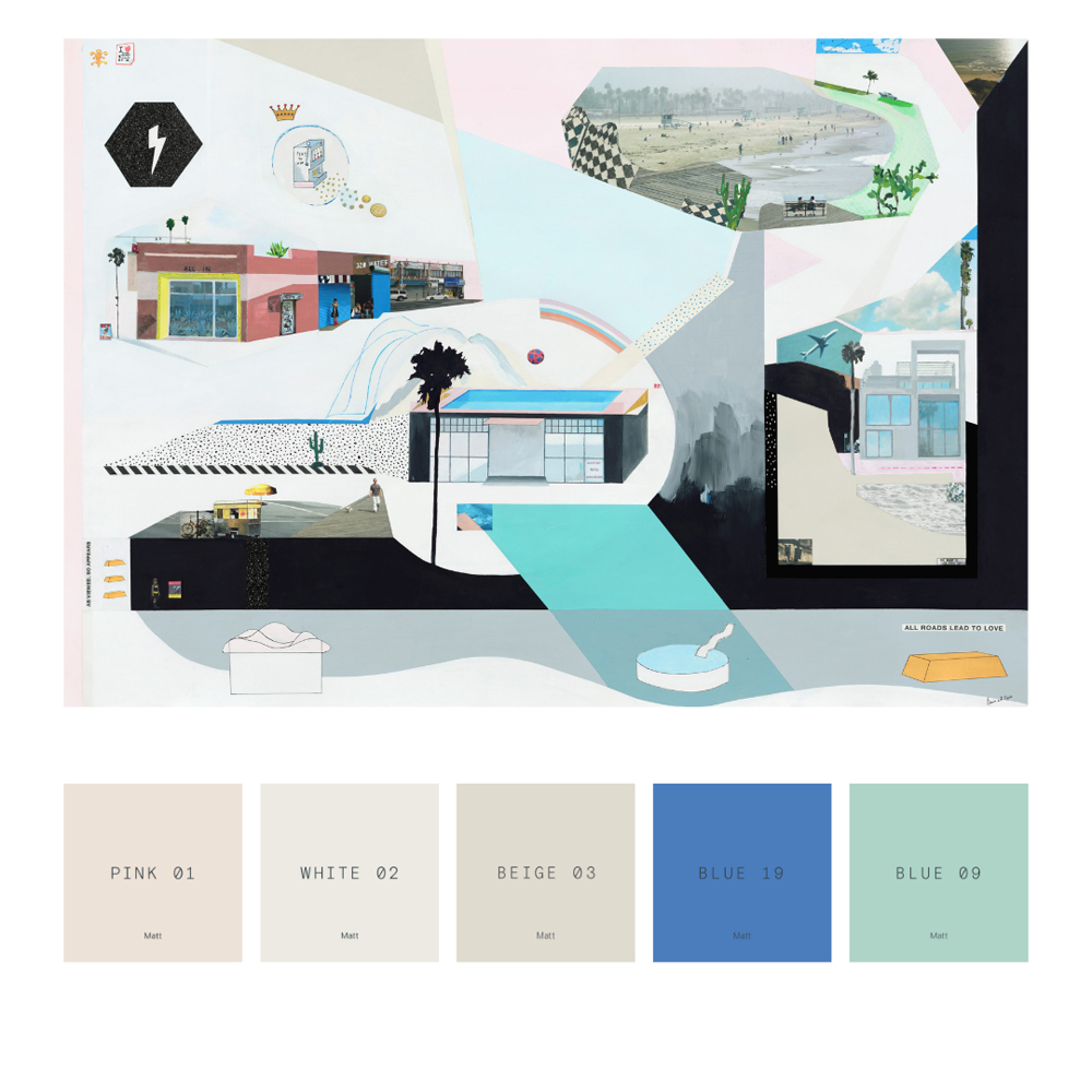
Brighton-based artist, Bonnie and Clyde describes Play To Win as “a real-time reflection of my personal journey and how you can use the imagination to carve out your life's direction”. We think it’s totally dreamy, with a whimsical colour palette to match. “Consider either Pink 01 or Beige 03 on your walls to really showcase this piece”, says Tash. Using a rich blue, like Blue 19, as the connecting thread, “this could be a great colour palette to use throughout a home. It’s very versatile and easy on the eye”. A real conversation starter in a living room or dining room.
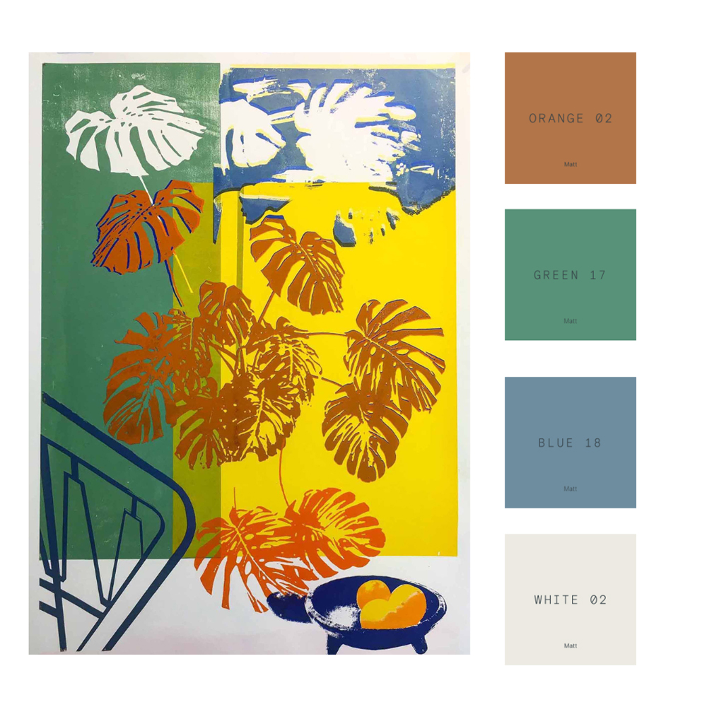
If it’s a vibrant colourway you’re after, then London-based French artist, Nathalie Kingdon’s screen print - Monstera Deliciosa Green And Yellow- evoke the warmth of summer, all-year-round. “It’s got some gorgeously strong colours,” muses Tash, “so whether green, blue or orange, I’d pull out one of these and run with it, mirroring one of the supporting colours as an accent throughout the room” she explains. “Green 17 on your skirting and door frames and White 02 on your walls would create a great framing effect. Or you could even go Green 17 or Blue 18 on your ceiling.” Once you’ve decided which paints to use on your walls, pick out your accent colours, in this case a warming shade similar to Orange 02, as an upholstered chair, cushions, or painted coffee table.
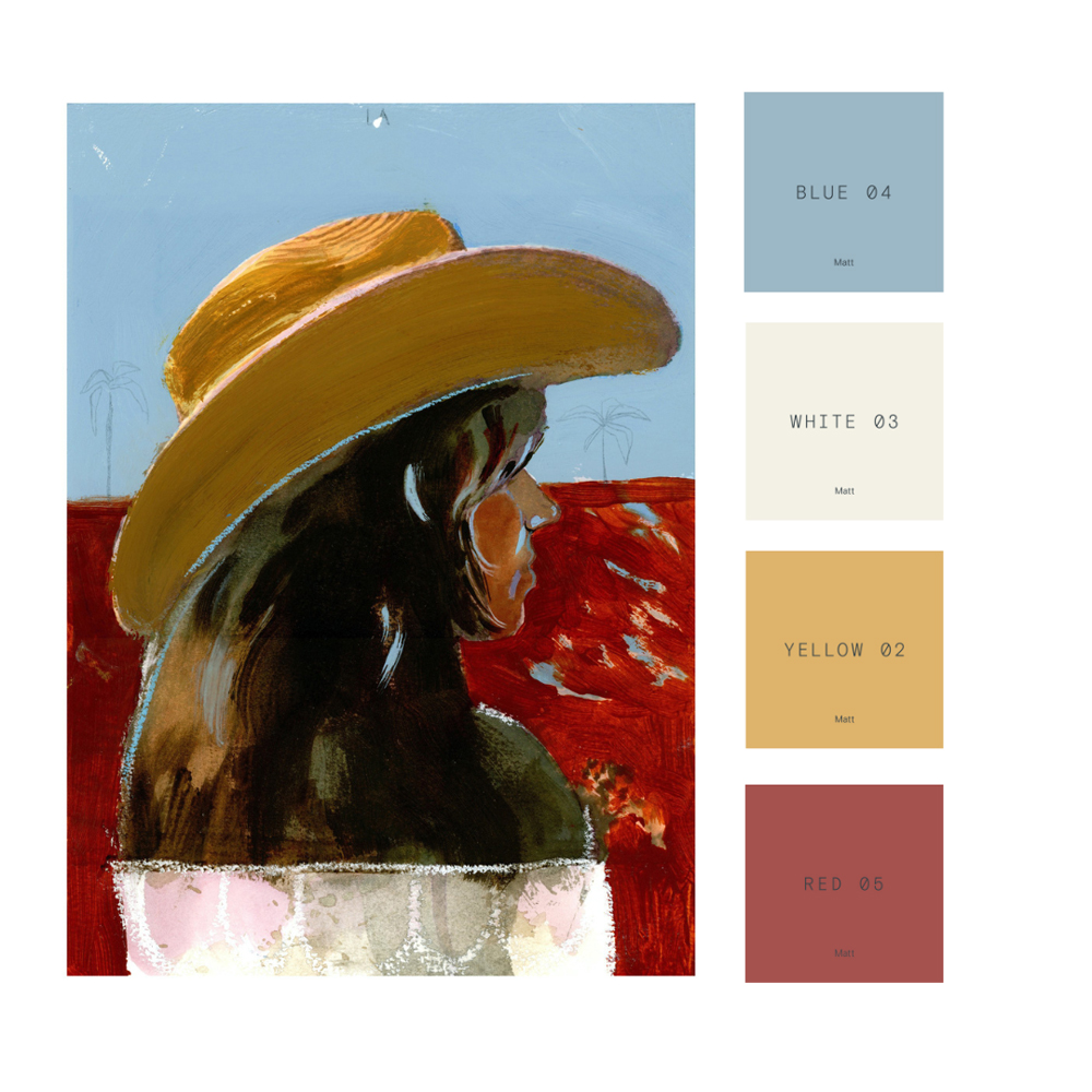
“I'm in love with this painting by Marcelina Amelia,” says Tash “and it’s a really gorgeous palette to match”. Borrowing from traditions of her Polish heritage and folklore, her work contemplates themes of self-acceptance, gender and representations of female sexuality. If you want this piece to stand out in your home, Tash recommends “choosing White 03 as the background colour paired with an accent of Yellow 02 or Blue 04”. Or, if you were hanging it as pride of place in a kitchen diner, “mirror those yellow hues with Yellow 02 cabinets and Red 05 accents”, she explains.