


The most calming colour palette for your home based on colour psychology

If you’ve ever walked into a room that’s had a really jarring effect on you, then you’ll know how visceral the effects of colours can be on our body and mind. Colour psychology - the study of how colour influences our emotions and decision-making - helps us to understand why. At Lick, we believe that colour psychology is fundamental for discovering the colours that help you look after your mental health and wellbeing. That’s why our Lick Studio team has carefully selected 6 of the most calming colours in our paint range, to bring you a palette that will leave you feeling soothed. Take a closer look at the psychology behind our calming colour palette and how to style the colours in your home.
The colour psychology behind our calming colour palette
From airy blues to grounding neutrals, comforting pinks, and nature-inspired greens, each of these six soothing hues features; low saturation, earthy notes and warm undertones. According to colour psychology, blue is the most calming colour for the mind; pink is the most physically soothing and will leave you feeling swaddled. Green, the colour of nature, is the least demanding of all the colours and is very restful on the eye. Whilst ever dependable neutrals help to ground us in the present moment. As Tash Bradley, our Director of Interior design, explains;
The result is a palette of hues that feel restful when you are around them, and give you that feeling of being wrapped gently in colour.
Tash Bradley
Add some calm into your home
What makes these paint colours calming?
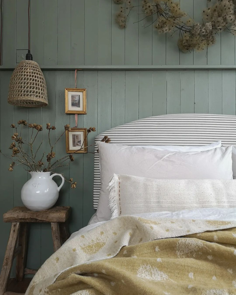
Sage Green 02 is restful on the eye and “the ultimate colour for quiet reflection and personal growth”, according to Tash. It will instantly breathe life into your home, transporting you to the great outdoors.
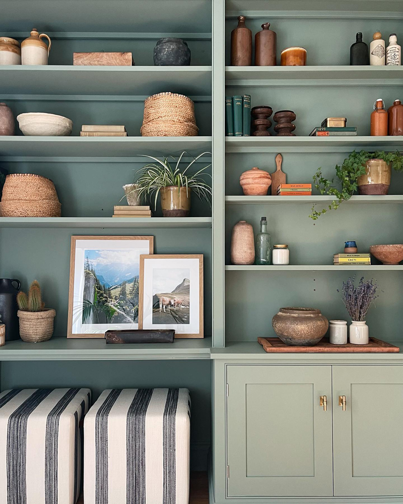
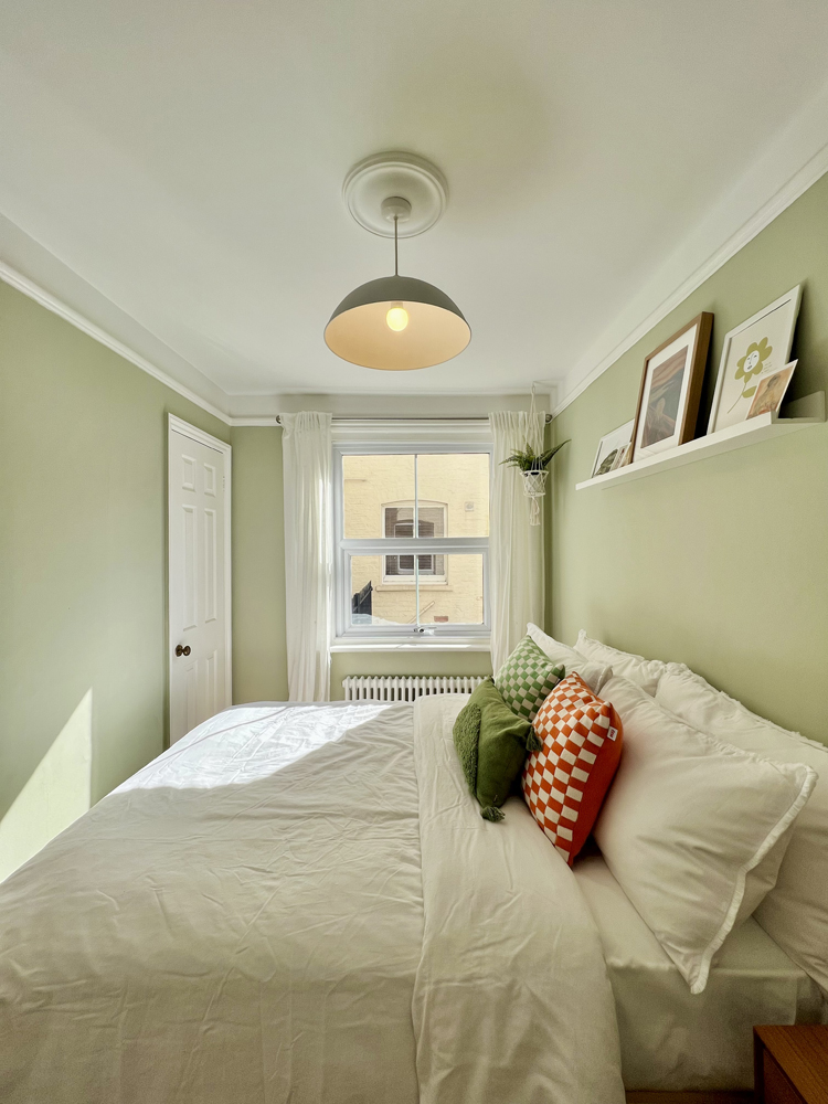
Whilst soothing Green 09 is “the perfect balancing hue for your mind, body, and emotions. It creates a sense of harmony and reassurance” explains Tash.
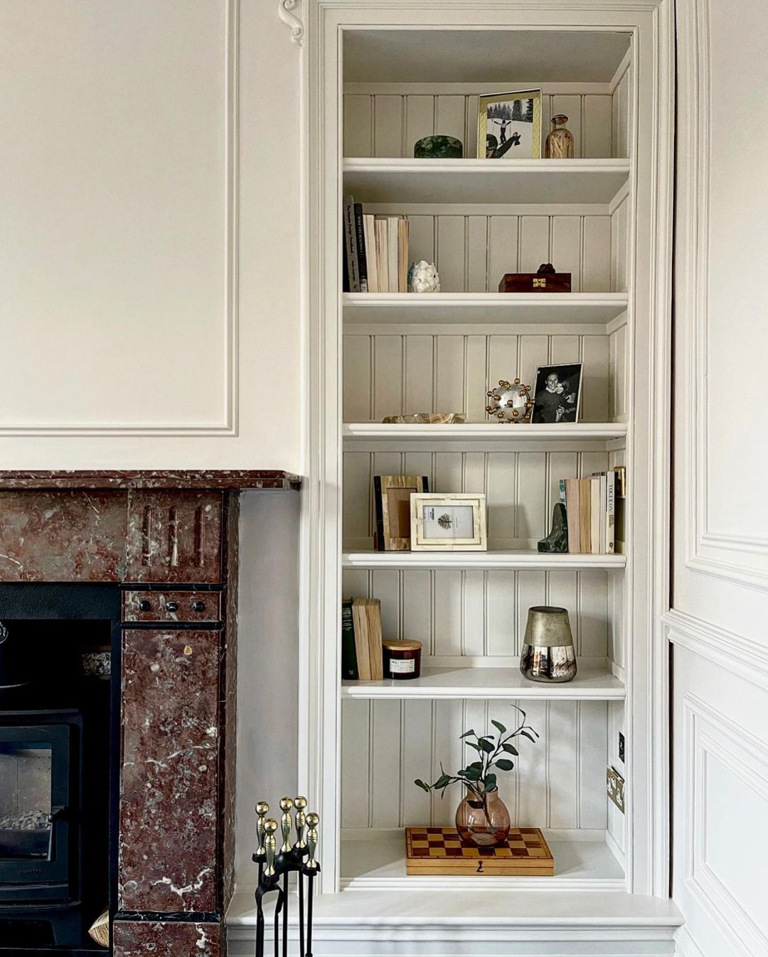
Fluffy as a cloud, White 06 is much more than just a white paint. Those warming pink undertones will leave you feeling physically soothed.
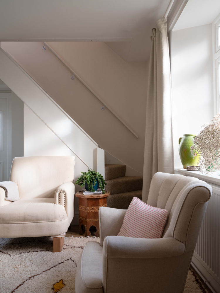
The gentle hues in muted Pink 07 have an all-encompassing, nurturing effect. Pink is a colour that makes your shoulders drop and your body relax. Or, as Tash describes, "it's a cuddle in a paint tin".
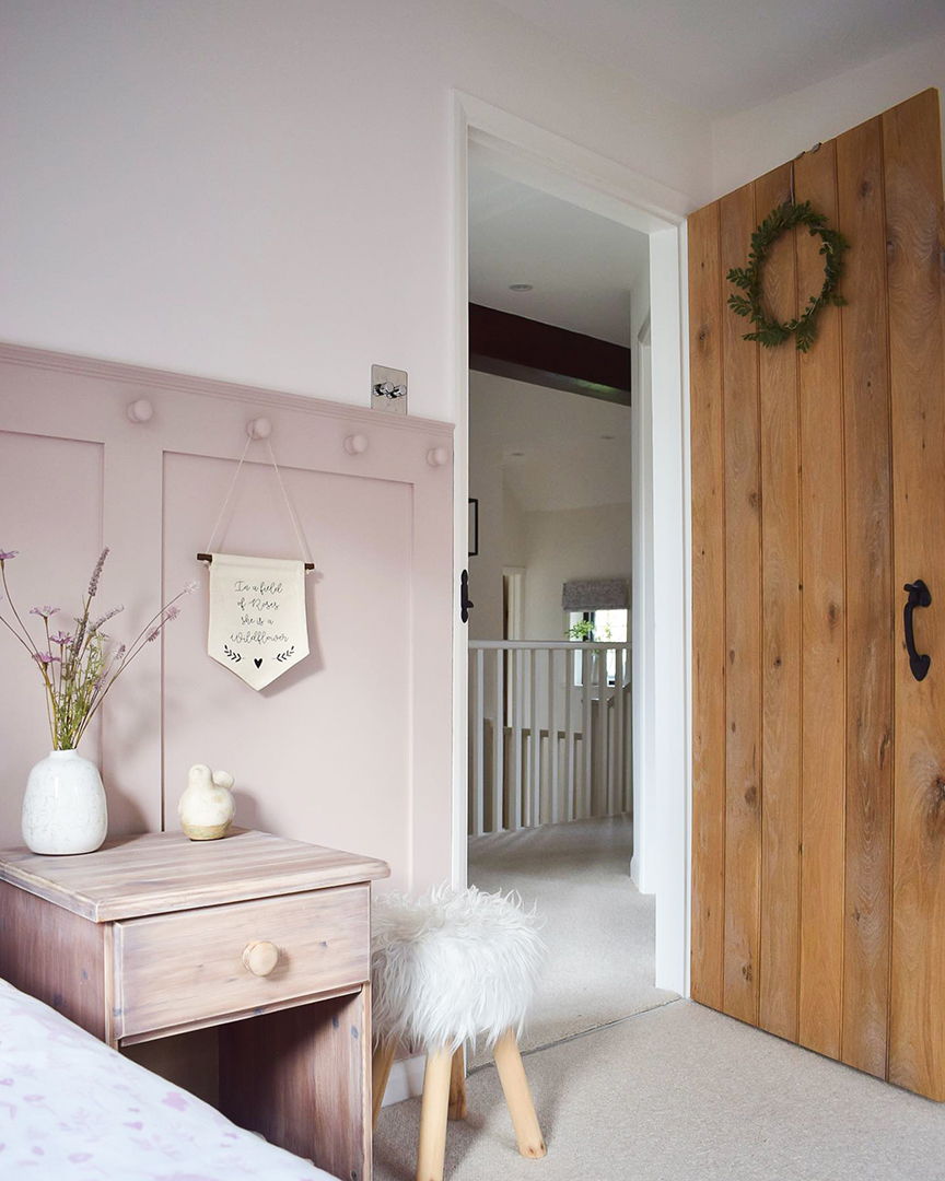
The “the colour of the mind”, Blue 15 “will soothe even the most frantic of mental chatter”, says Tash. For the dreamers amongst you, Tash explains how those soft grey undertones “will help you feel open and calm, encouraging self-reflection and clarity of thought". Blue can also aid sleep and help you unwind.
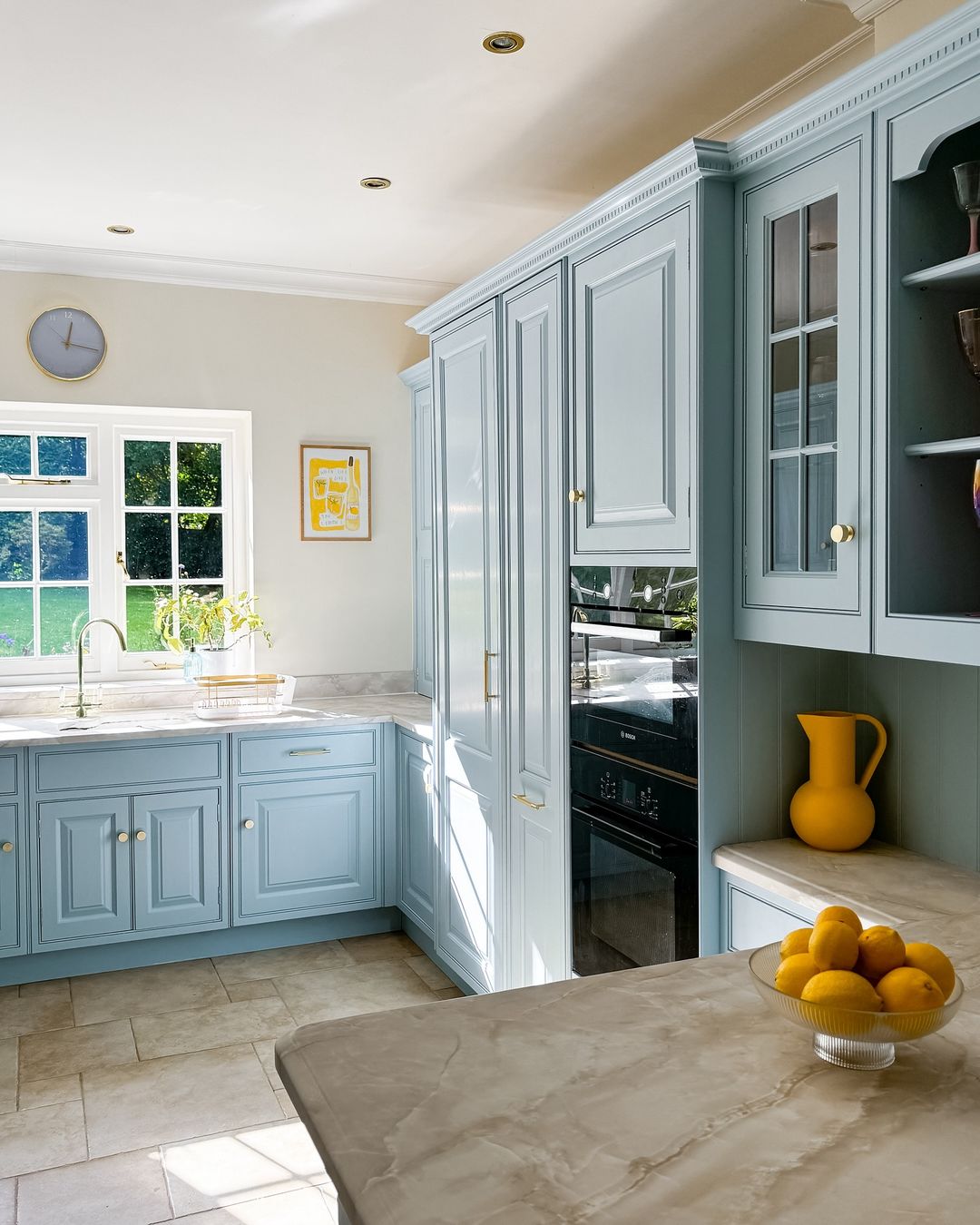
With just a touch of grey and yellow, Beige 03 is the colour of chalky rock cliffs and will bring you back down to earth. This timeless neutral is a great colour for feeling grounded in the present moment and will leave you feeling stable, reassured, and supported.
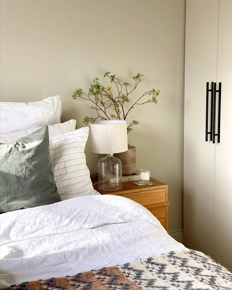
How to style our calming colour palette in your home
The all-important question: how to style our calming palette in your home? Fortunately, all six colours have been curated so that they will work in perfect harmony. We’re not suggesting that you use all six in one room (although throughout the house, it would create a seamless sense of flow). Setting aside a weekend to refresh a bedroom? Add a splash of character with one of these feature wall ideas. Repainting your home from floor to ceiling? Use this calming palette as the beginning of a mood board to inform your decor choices.
Different calming colour combinations
Chosen for their soothing qualities, you can select your favourite colours to use in specific rooms where you want to create a sense of calm, or use the entire range throughout your home to create a cohesive colour scheme. Pink 07 and White 06 paired with Blue 15 would work well in a bedroom due to their mentally and physically soothing qualities, whilst a grounding neutral like Beige 03 paired with Green 02 and Green 09 in a living room would create an instantly relaxing space.
Applying the calming paint colours to our Mindful 01 wallpaper
If you want to create your own Mindful 01 moment at home, pick up a paintbrush and have a go at PIY with our first ‘paint it yourself' wallpaper. Created with the soothing elements of biophilia in mind, the leafy, botanical design will draw you outdoors and take you into nature. Apply your favourite calming colour combination, from a leafy-inspired palette of Green 02 and Green 09, or something a little more neutral with White 06 and Beige 03. Simply choose your favourite colours from our calming palette, grab your paintbrushes, and get painting.
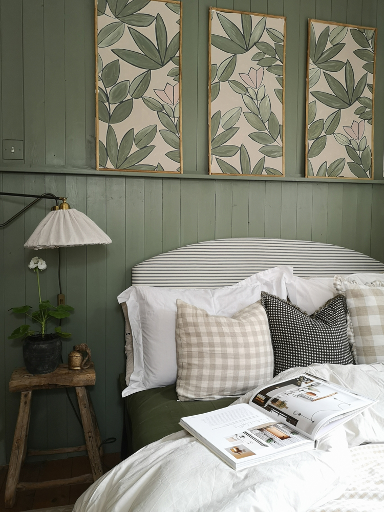
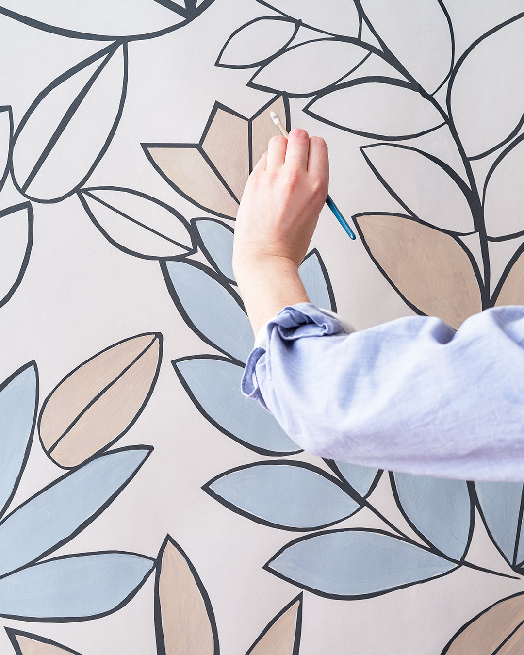
Introduce a little colour therapy into your life and transform your home into a calming haven with our calming colour palette and mindful wallpaper. For more wellness tips at home, check out these 7 easy home updates that can improve your wellbeing and these 10 self-care tips to try at home.